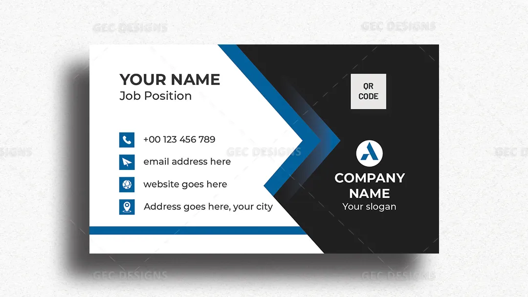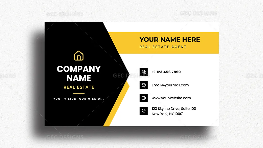


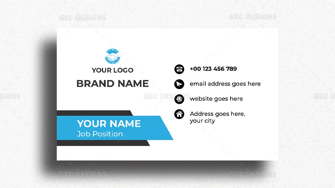
A strong black panel anchors the company branding, while golden-yellow accents and a white contact area create sharp visual contrast. The angular center division adds movement without sacrificing readability, and bold sans-serif typography establishes a clear hierarchy between the agency name, agent identity, and contact information.
Real estate agents, brokers, property consultants, and agency teams can customize the layout with their own logo, name, phone number, email, website, and office address. Its separate brand and contact sections make important information easy to scan during brief client interactions. The design works particularly well for professionals seeking a confident identity that can remain consistent across networking, property presentations, and everyday client communication.