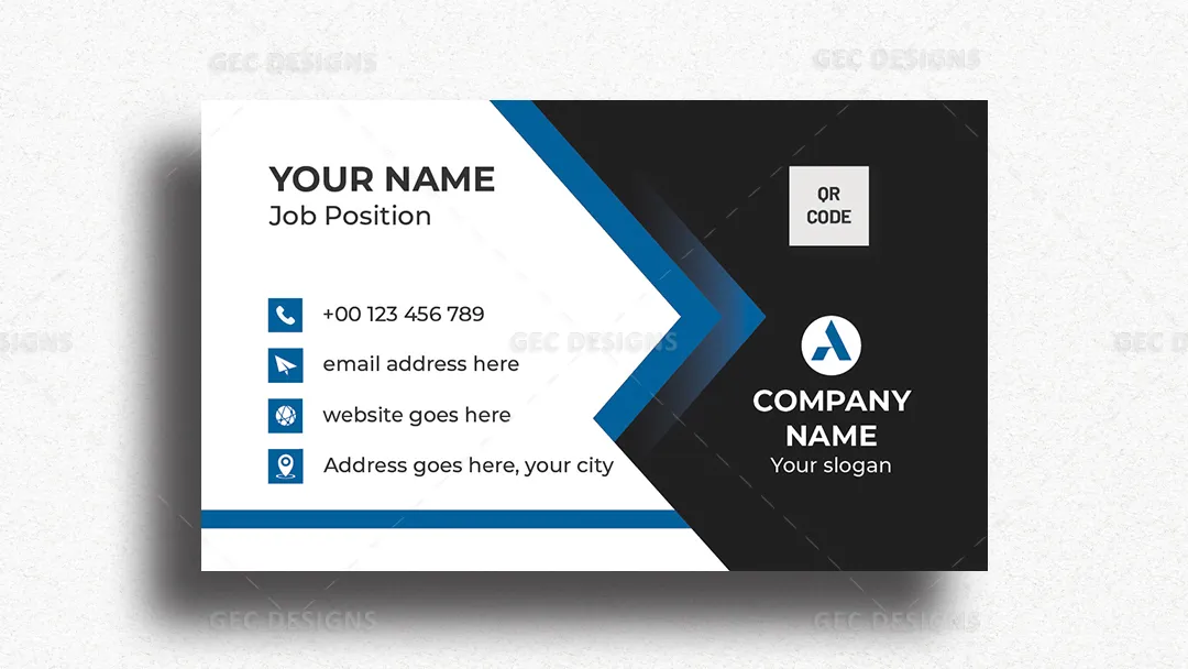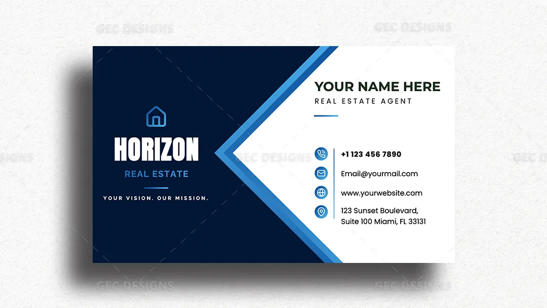


A deep navy panel and crisp white background create a strong two-part composition, connected by layered blue diagonal accents that give the design a sharp architectural character. Bold agency typography, clean sans-serif lettering, blue contact icons, and generous spacing establish a clear visual hierarchy without relying on property photography.
The structured format gives real estate agents, brokers, and property consultants dedicated areas for personal details and agency branding. Phone, email, website, and office address information remains easy to scan, making the card practical for face-to-face networking and client follow-up. Its restrained corporate appearance also makes customization straightforward for agencies that want consistent business cards across multiple team members.