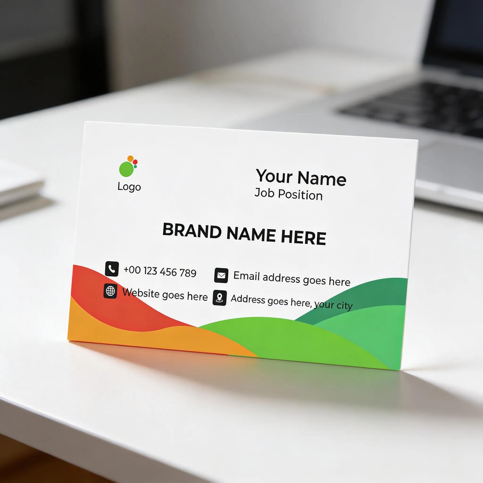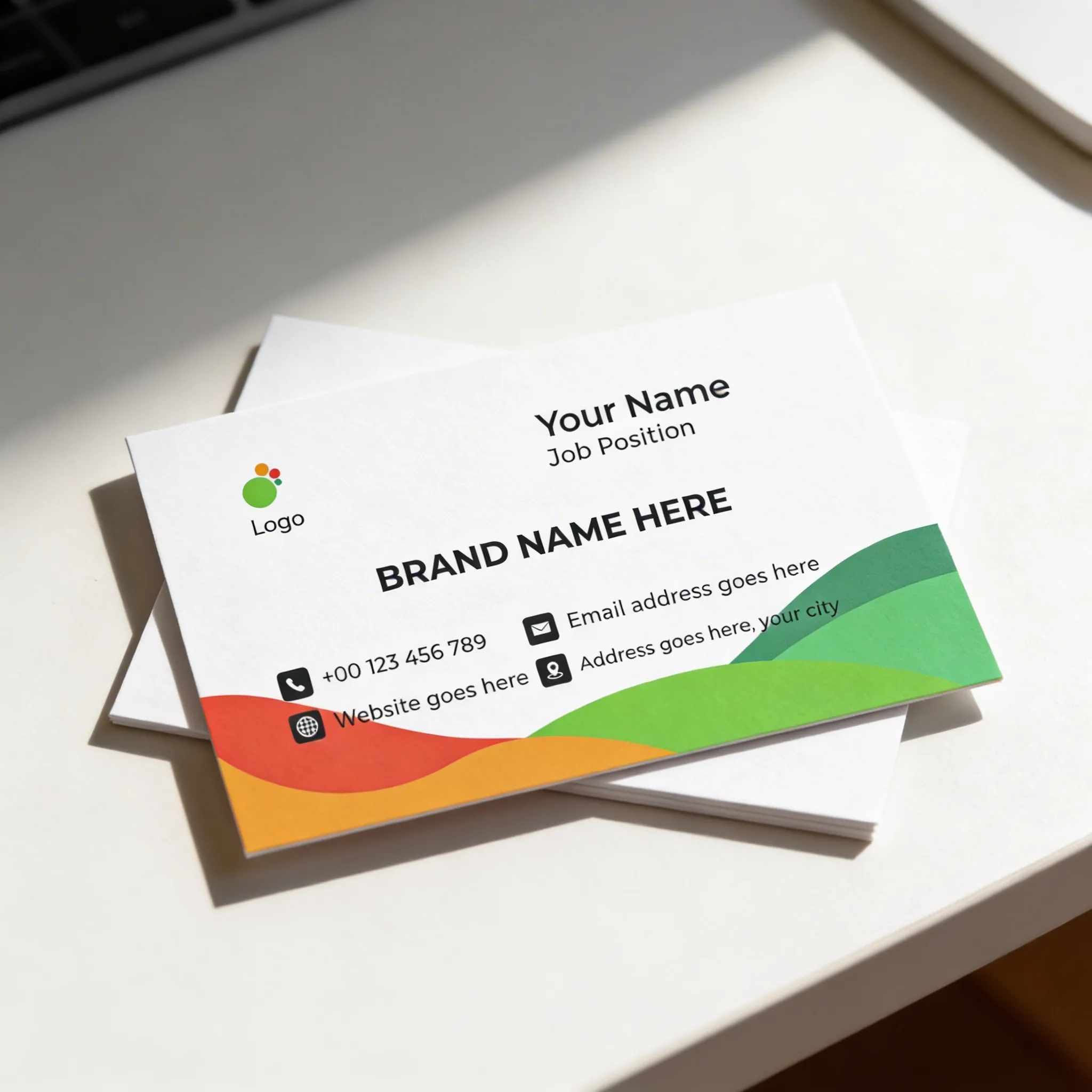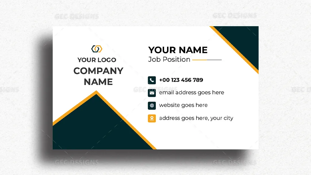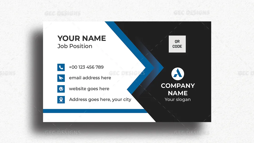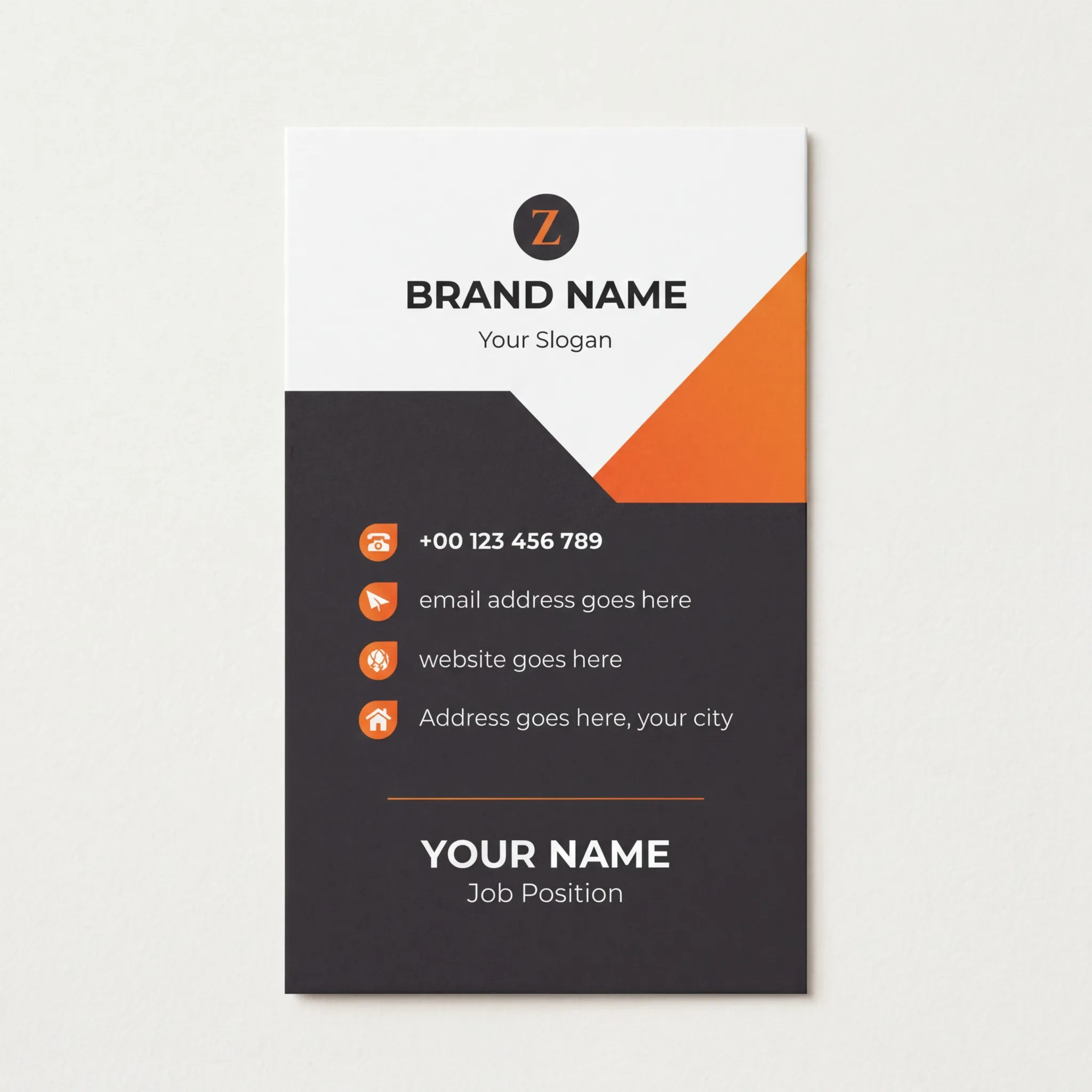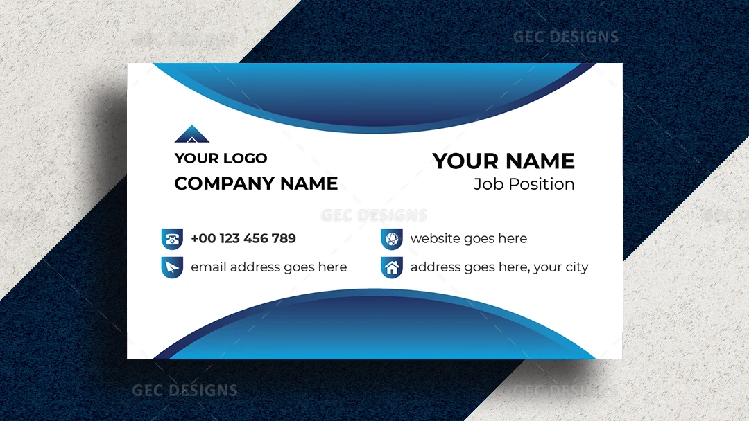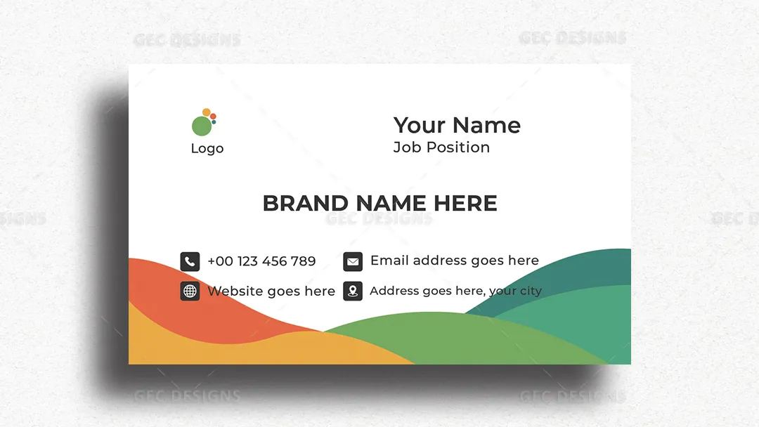


This visiting card design combines a clean white layout with bold, colorful wave elements at the bottom, creating a fresh and approachable brand identity. The mix of green, red, and orange tones communicates growth, energy, creativity, and positivity. The centered brand name layout strengthens visual balance while keeping the overall design minimal and professional.
The structured contact section with clear icons ensures easy readability and an organized presentation. The use of white space enhances clarity, making the card feel modern and confident without appearing cluttered. This style is particularly effective for businesses that want to appear friendly, innovative, and customer-focused while maintaining professionalism.
Fully editable in Adobe Illustrator and optimized in CMYK with 300 DPI resolution, this template is ready for high-quality printing. A well-designed visiting card like this improves first impressions, increases brand recall, and helps create meaningful conversations that can turn into strong business leads.