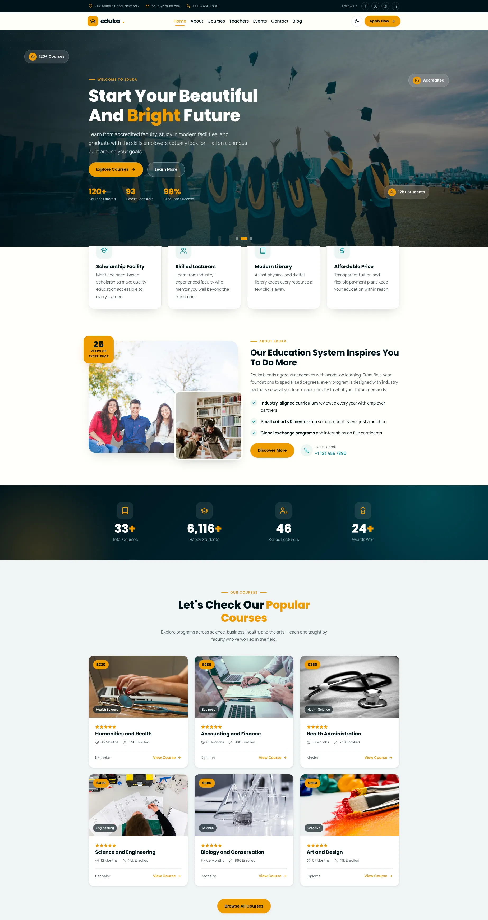
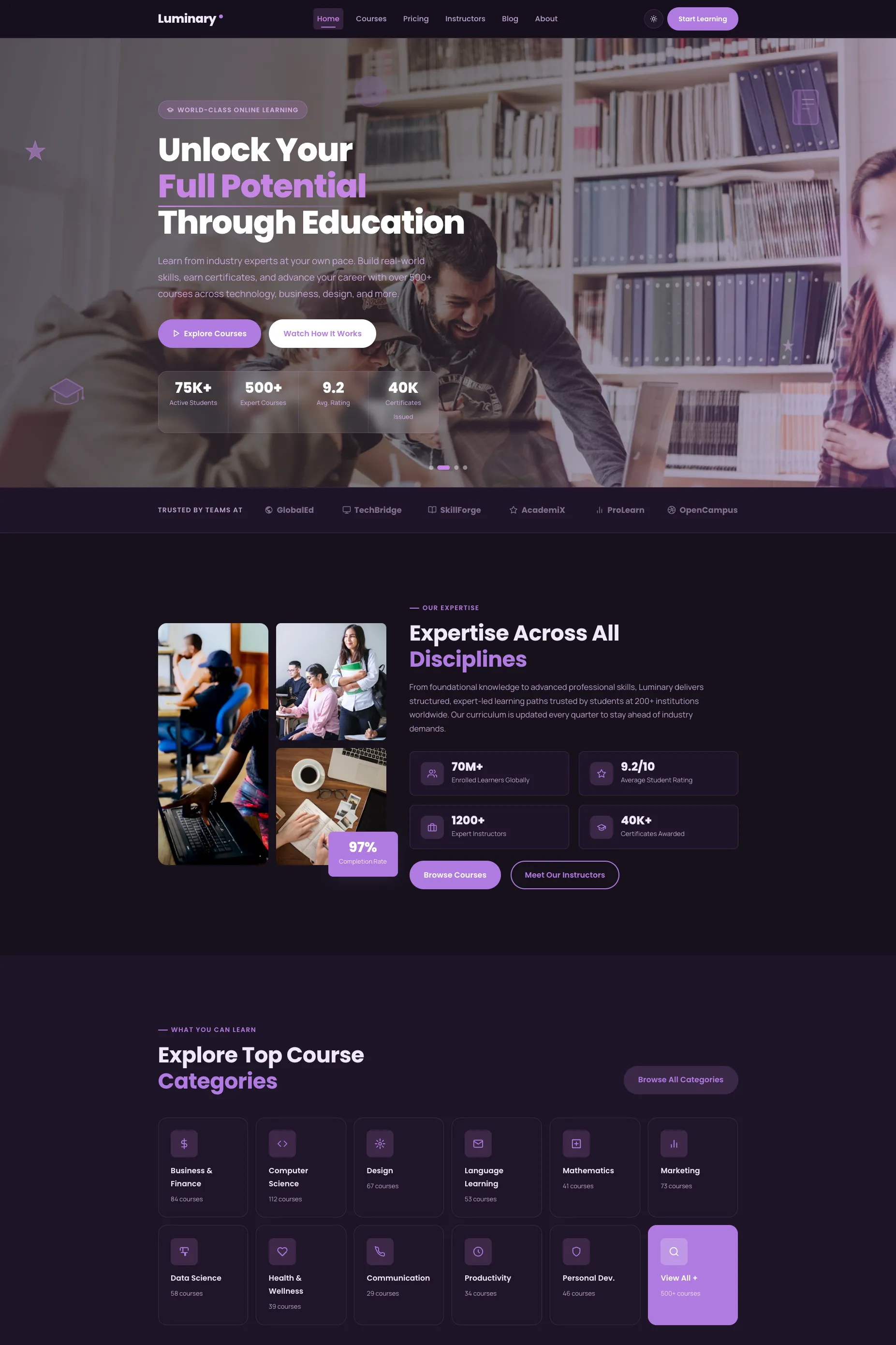
Eduka is a clean, premium, and fully responsive education website template designed for schools, colleges, universities, coaching institutes, and online course platforms. Built as a single, conversion-focused landing page, it gives any educational brand a polished web presence out of the box, no design work required. From the cross-fading hero to the enrollment form, every section is structured to guide a prospective student from first impression to "Apply Now."
The template ships ready to launch: semantic HTML5, a tuned meta description, fast lazy-loaded imagery, and a mobile-first Bootstrap 5 grid mean it's optimized for SEO and Core Web Vitals from the moment you download it.
Design characteristics & professional look
Eduka uses generous whitespace, a strict typographic hierarchy, and a consistent system of radii, soft shadows, and spacing to achieve an enterprise-grade, "expensive" feel. Headings are set in Poppins for confident structure, while body text uses Manrope for high readability across long passages. Cards lift gently on hover, sections reveal as you scroll, and decorative chips in the hero drift with the cursor, micro-interactions that signal craftsmanship and keep visitors engaged longer. A built-in light and dark mode (with no flash on load and the user's choice remembered) extends the premium feel and improves accessibility and comfort.
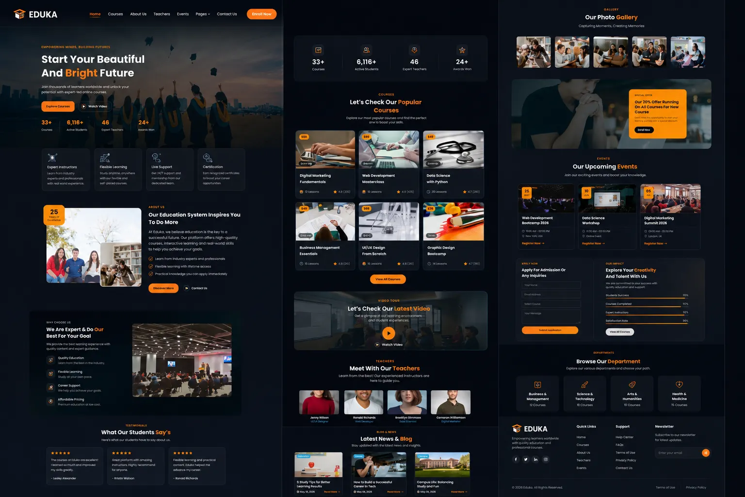
Eduka Education & Online Course Website Template
Modern education and online course website template crafted for schools,
colleges, universities, coaching centres, online learning platforms,
training institutes, tutors, educational organisations, and professionals
who want to promote courses, showcase faculty, and attract new students.
Color Palette
Eduka uses a carefully balanced five-color palette designed to communicate trust,
professionalism, clarity, and positive educational progress.
-
Dark Navy
#001219 — communicates authority, depth, and
stability. It anchors dark sections, footer areas, and primary text.
-
Deep Teal
#005F73 — represents trust and professionalism.
It is used throughout gradients and immersive dark content sections.
-
Teal
#0A9396 — reflects knowledge, calm, and progress.
It works as the secondary accent for icons, links, and supporting interface elements.
-
Amber
#EE9B00 — adds optimism, energy, and
approachability. It is reserved for primary calls to action and important highlights.
-
Off-White
#FFFFFA — creates a clean and airy canvas
that maximizes contrast, readability, and visual comfort.
Template Features
Eduka includes a complete, conversion-focused education website experience designed for
schools, colleges, universities, coaching institutes, training centres, and online course
platforms.
Key features include:
-
Fully responsive layout for mobile, tablet, laptop, and large desktop screens
-
Built with Bootstrap 5, semantic HTML5, CSS3, and vanilla JavaScript
-
Light and dark mode toggle with saved visitor preference
-
No-flash theme loading with the selected mode applied before first paint
-
Cross-fading hero slideshow with layered educational imagery
-
Mouse-parallax floating elements that add depth and subtle interaction to the hero
-
Sticky responsive header with active-link scroll-spy navigation
-
Mobile overlay navigation that opens above the page without pushing content downward
-
Feature-highlight cards for presenting key educational benefits
-
About section with supporting imagery and an experience highlight badge
-
Animated statistics counters for student numbers, courses, faculty, and achievements
-
Popular course cards with images, categories, metadata, pricing, and action links
-
Video section with a lazy-loaded modal player
-
Faculty and teacher profile section with professional portrait cards
-
Why-choose-us section with structured educational benefits and visual indicators
-
Photo gallery with a built-in, dependency-free lightbox
-
Large-image gallery view with previous and next navigation
-
Keyboard, Escape-key, and swipe support inside the gallery lightbox
-
Special-offer banner for admissions, scholarships, or limited-time promotions
-
Upcoming events section for seminars, workshops, open days, and campus activities
-
Enrollment and admission enquiry form included as a front-end demonstration
-
Animated skill-progress bars for outcomes, capabilities, or academic strengths
-
Department cards for presenting major academic areas and programs
-
Student testimonial section for social proof and trust building
-
Latest news and blog cards for announcements, insights, and content marketing
-
Partner and trust-logo area for institutional affiliations and supporting brands
-
Full footer with contact details, quick links, course links, and social profiles
-
Newsletter subscription field included as a front-end demonstration
-
Smooth reveal-on-scroll animations throughout the page
-
Animated scroll-to-top button for easier long-page navigation
-
SEO-ready structure with semantic markup and an optimized meta description
-
Accessible image alt text, ARIA labels, and keyboard-friendly interactions
-
Support for
prefers-reduced-motion accessibility settings
-
Poppins heading font paired with Manrope body typography
-
Easy editing through plain static HTML, CSS, JavaScript, and image files
Sections Included
Eduka provides a complete single-page website structure covering the major sections an
educational institution or online learning brand needs to present courses, establish trust,
and generate admission enquiries.
-
Hero slideshow with value proposition and primary calls to action
-
Feature highlights
-
About the institution
-
Animated statistics and achievement counters
-
Popular courses
-
Video experience section
-
Teachers and faculty profiles
-
Why choose us
-
Photo gallery with lightbox
-
Special-offer and admissions banner
-
Upcoming events
-
Enrollment form and skill-progress indicators
-
Academic departments
-
Student testimonials
-
Latest news and blog
-
Partners and trust logos
-
Full footer with contact details, useful links, and newsletter signup
Framework and Architecture Details
Eduka is built with Bootstrap 5 for its responsive grid system, layout alignment,
navigation structure, modal behaviour, spacing utilities, containers, rows, columns,
responsive image ratios, and form layouts.
The light and dark modes use Bootstrap's native data-bs-theme colour-mode
system together with custom CSS variables. The visitor's selected preference is saved
and applied before the page is displayed to prevent a flash of the incorrect theme.
Interactive features are powered by lightweight vanilla JavaScript without requiring
jQuery. These features include the theme toggle, hero slideshow, parallax elements,
active-link scroll spy, mobile menu behaviour, animated counters, progress bars,
reveal animations, video modal, gallery lightbox, form feedback, and scroll-to-top control.
Poppins is used for headings and interface titles, while Manrope is used for body text,
descriptions, course information, and form content. The downloadable package is intended
for direct static editing through the included HTML, CSS, JavaScript, image, font, and
vendor files.
Common Bootstrap classes used include:
container,
row,
col-lg-*,
col-md-*,
col-sm-6,
g-3,
g-4,
g-5,
d-flex,
flex-wrap,
align-items-center,
justify-content-between,
text-center,
navbar,
navbar-expand-lg,
navbar-toggler,
collapse,
navbar-collapse,
modal,
ratio,
ratio-16x9,
ratio-4x3,
btn,
form-control,
form-select,
input-group,
w-100,
position-relative,
overflow-hidden,
and visually-hidden.