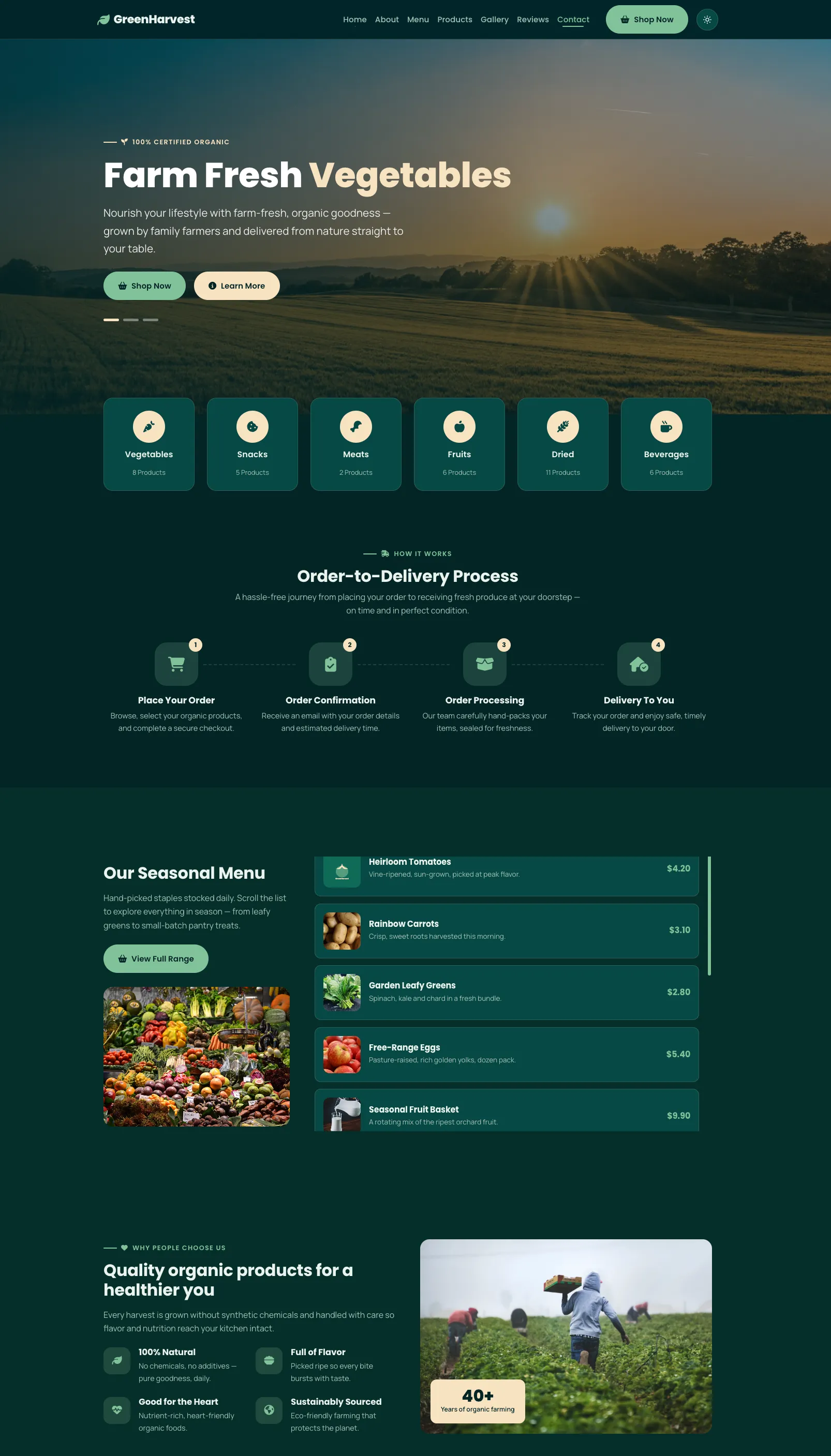
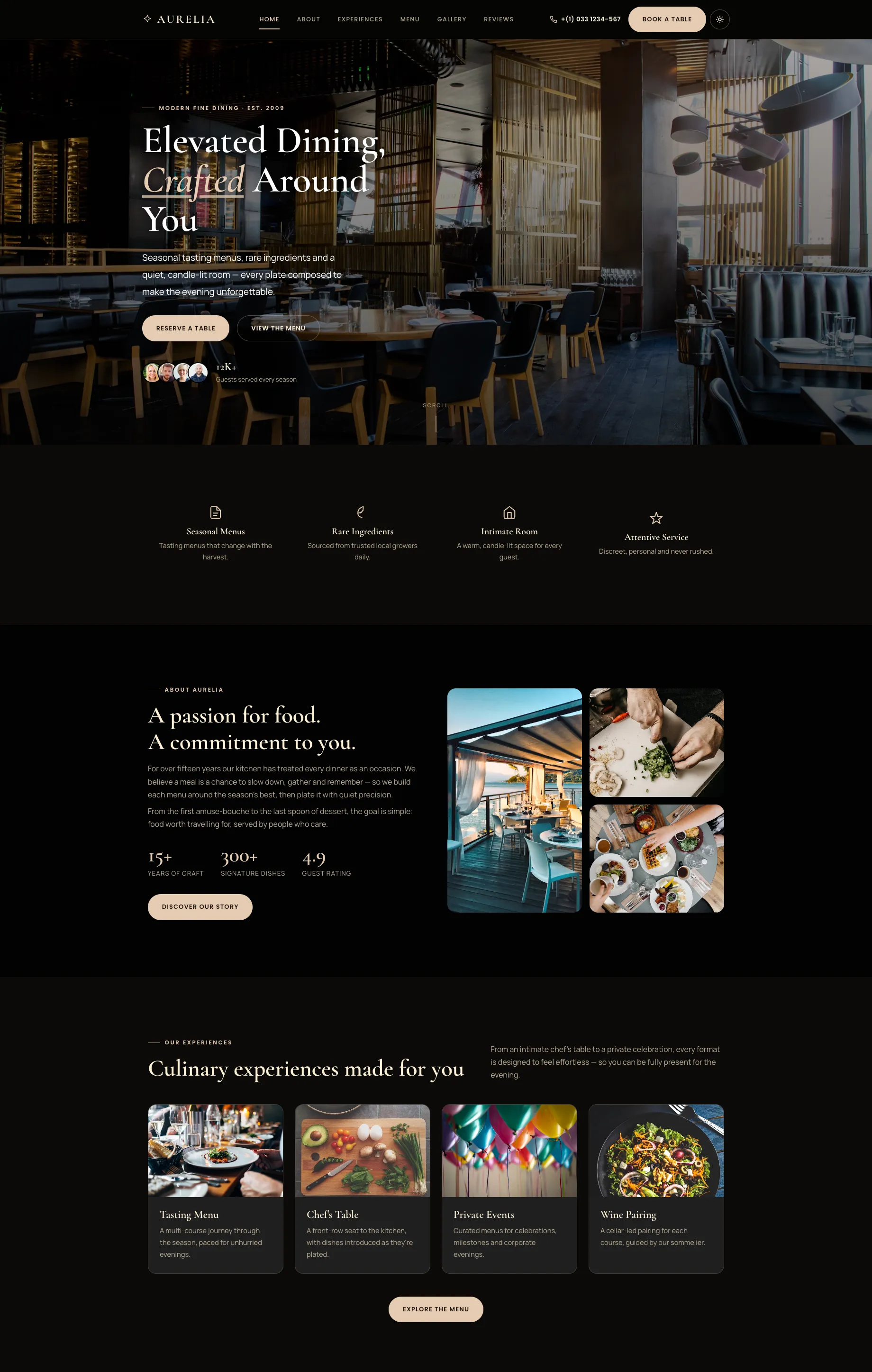
GreenHarvest is a clean, modern, and fully responsive organic farm and food website template, built with the latest Bootstrap 5.3, HTML5, and CSS3. It is purpose-designed for organic farms, fresh produce and grocery brands, farm-to-table businesses, organic food stores, agriculture and agribusiness startups, dairy and eco-food producers, farmers' markets, gardening services, and healthy-food delivery, anywhere a warm, natural, premium presence matters.
Unlike most free templates in this category, GreenHarvest ships with a built-in light and dark mode. A navbar toggle lets visitors switch themes instantly; the choice is remembered on their next visit, and there is no flash of the wrong theme on load. The interface is powered entirely by lightweight vanilla JavaScript with no jQuery dependency, so pages stay fast, clean, and easy to maintain.
The template is a single-page (one-page) layout with 14 thoughtfully designed sections (excluding the header and footer), arranged to guide visitors smoothly from the hero down to the call-to-action. Standout touches include a cross-fading hero slideshow, a sticky-title menu with an independently scrolling item list, an auto-playing muted background video band, an image gallery with a click-to-zoom lightbox, a YouTube video popup, a six-slide testimonial carousel, and elegant reveal-on-scroll animations throughout, active-section highlighting in the navigation (scrollspy) and a back-to-top button round out a polished browsing experience.
Every section is laid out on Bootstrap's responsive grid, so the design adapts crisply across mobile, tablet, laptop, and large desktop screens, with a hamburger menu that overlays neatly on smaller devices. The colour theme is driven by a small set of CSS variables, making it quick to rebrand to your own palette. GreenHarvest is free for personal and commercial use with attribution; just keep the GEC Designs credit link in the footer.
Key Features:
- Built on Bootstrap 5.3, HTML5 & CSS3 — modern, standards-based, and reliable.
- Light & Dark mode — one-click navbar toggle, remembers the visitor's preference, no flash on load.
- No jQuery — fast, lightweight, dependency-light vanilla JavaScript.
- 100% responsive — mobile, tablet, laptop, desktop, and large-screen ready, cross-browser compatible.
- Single-page layout with 14 sections (excluding header & footer).
- Cross-fading hero with a rotating headline and clickable indicators.
- Sticky-title menu section — the heading stays fixed while the item list scrolls independently.
- Auto-playing, muted background video band with overlay text and stats.
- Image gallery with lightbox — click to view full size, navigate with arrows or swipe.
- YouTube video popup — play a video in an in-page lightbox player.
- Testimonial carousel — six customer reviews with autoplay, arrows, and indicators.
- Reveal-on-scroll animations — smooth, staggered entrance effects across sections.
- Scrollspy navigation — the active menu item highlights as you scroll, with an animated underline on hover and active state.
- Back-to-top button, sticky header, and a mobile hamburger menu that overlays the content.
- Premium typography — Poppins for headings, Manrope for body text.
- Font Awesome 6 icons throughout.
- Easy rebranding — colour theme controlled by simple CSS variables.
- Clean, well-organized, comment-friendly code — easy to customize even without advanced coding knowledge.
- SEO-friendly markup — semantic HTML5, correct heading order, descriptive alt text, and accessible buttons and links.