This is a practical guide to choosing the right color palettes for your industry. Discover 300+ ready palettes for branding, UI, and marketing, with easy copy and download options.
This comprehensive guide offers practical examples for selecting the ideal color palettes for your industry, including branding, websites, and marketing materials. It explains why random colors often fail, how professional color combinations enhance trust and readability, and how to select colors that align with customer expectations.
This guide also introduces our preset Color Palettes tool with 300+ industry palettes, where you can copy HEX/RGB/HSL/CMYK codes and download palette images to use in real projects.
If you’ve ever designed a poster, a website section, an Instagram creative, a brochure, or even a simple banner, you already know one painful truth: Choosing colors is easy… Until you actually have to choose them.
Most people start with one color they like. Then they add a second color that “matches.” Then they add a third for buttons or highlights. And suddenly everything feels off. The design looks either too loud, too dull, too childish, or simply “not professional enough,” even though the layout is good and the content is correct.
That’s because color is not decoration. Color is communication.
Before a user reads your headline, before they understand your offer, and before they trust your brand, they feel the color choices. And those feelings matter a lot more than most people realize. Studies and marketing research consistently show that colors influence perception, emotions, and brand recall, especially in competitive industries where trust and clarity are everything.
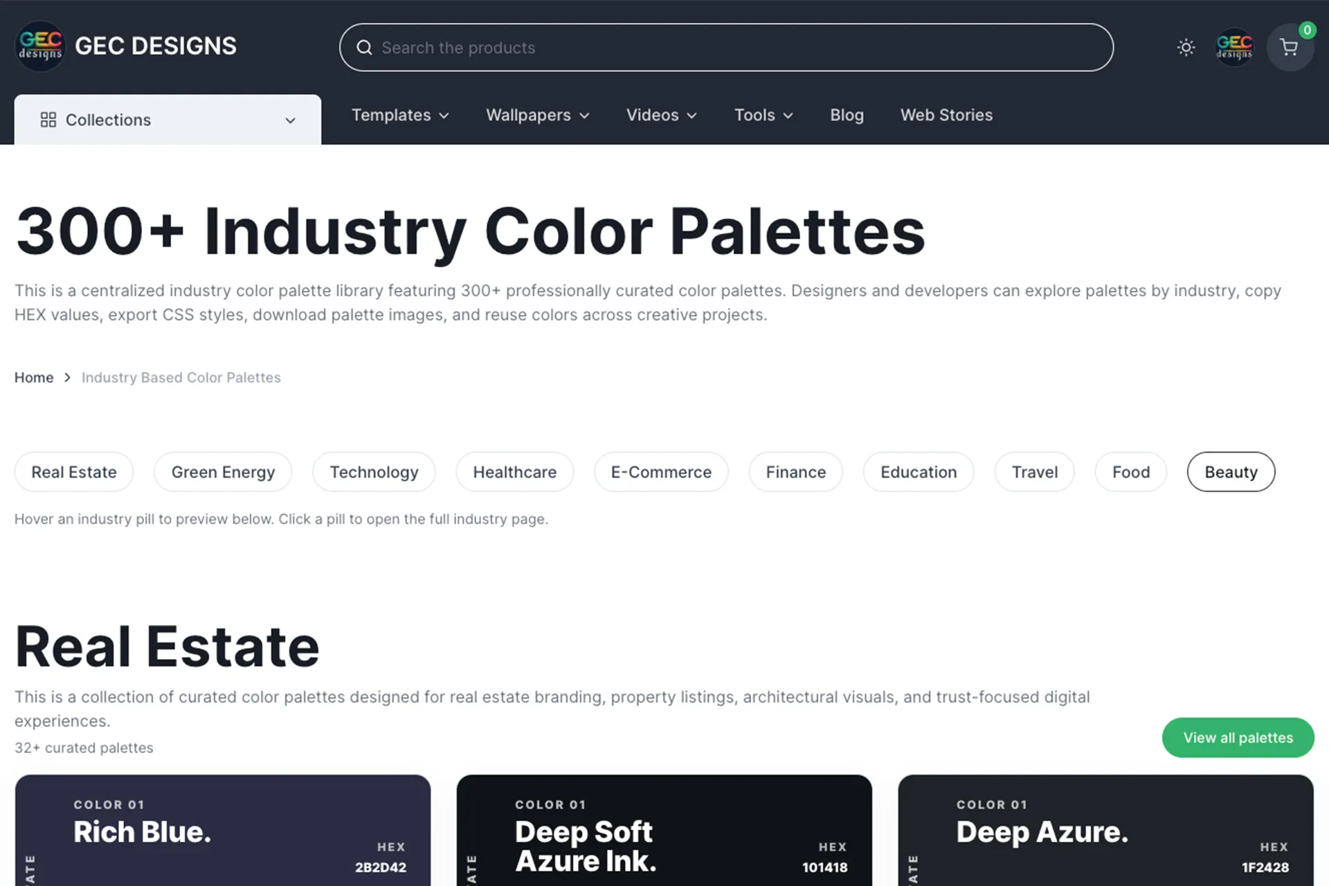
This is exactly why we built the preset Color Palettes tool: a ready-to-use library of 300+ industry-based palettes. You can browse, copy the color codes, and download palette images for your projects. It’s built for designers, web developers, marketers, and also beginners who just want colors that work without spending hours experimenting.
🎨 Ready to stop guessing colors?
Pick your industry and choose a palette that looks professional instantly. Copy HEX, RGB, HSL, or CMYK codes and download the palette image in just one click.
👉 Click here to access the Color Palette Library
Why the Right Colors Can Transform Your Brand Instantly?
A “color palette” is simply a planned set of colors that work well together. Usually, it includes a primary brand color, a secondary supporting color, a neutral background color (or two), and one accent color for highlights like buttons, badges, or call-to-action areas.
Now here’s the important part: The palette is not only about beauty, but it’s about consistency, meaning, readability, and user behavior.
When your colors are consistent, your brand looks stable. When your colors are balanced, your content becomes easier to read. When your accent colors are chosen properly, your buttons look clickable. And when the overall palette fits the industry, users feel like they are in the “right place.”
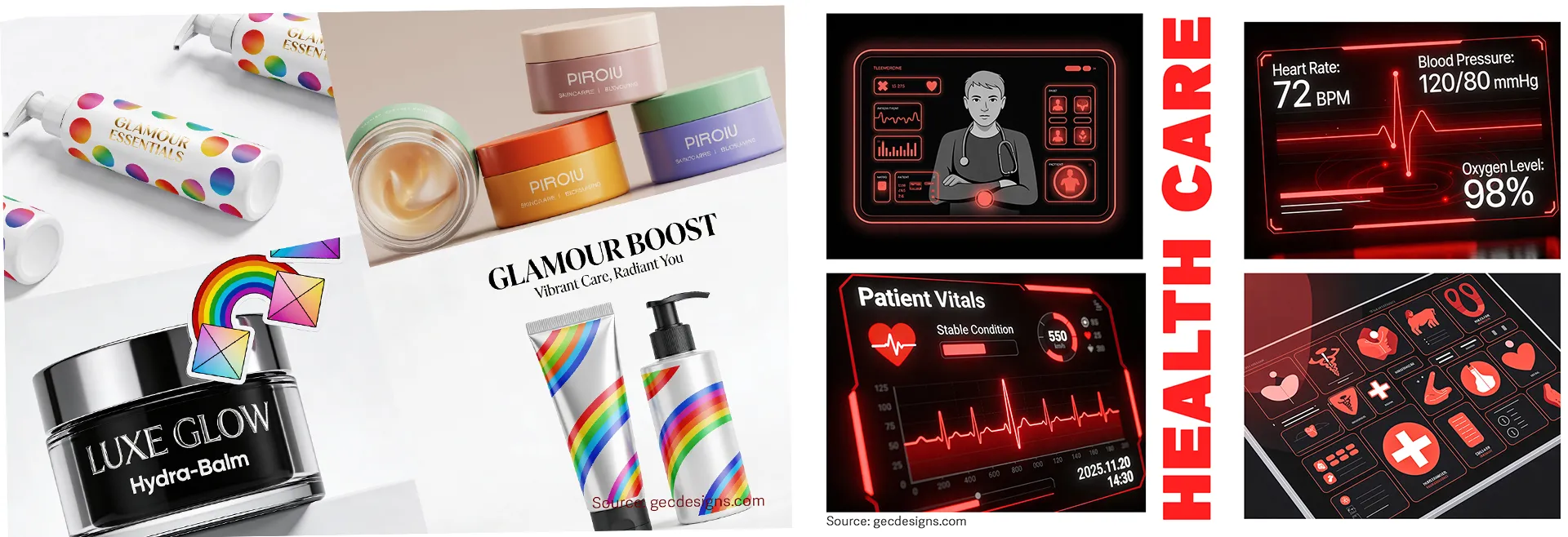
For example, imagine a healthcare website using neon reds and harsh blacks everywhere. Even if the service is genuine, the colors can create anxiety. On the other hand, imagine a luxury beauty brand using random playful rainbow colors like a kids’ toy package. The product might be premium, but the colors make it feel cheap. This is why professional brands don’t choose colors randomly. They choose colors strategically, based on the message they want to send.
Another hidden reason palettes matter is speed. When you already have a palette, you make decisions faster. You’re not stuck in “which blue is better?” You already know your main blue, your background shade, and your accent. That saves hours across every single project.
🎨 Ready to stop guessing colors?
Pick your industry and choose a palette that looks professional instantly. Copy HEX, RGB, HSL, or CMYK codes and download the palette image in just one click.
👉 Click here to access the Color Palette Library
Industry-based palettes: why one palette doesn’t fit every business
A common mistake is copying colors from a brand you personally like, without thinking about your industry.
Colors carry expectations. People have learned, over the years, to associate certain color directions with certain industries:
• Finance often leans toward blues, deep neutrals, and clean whites because it signals trust and stability.
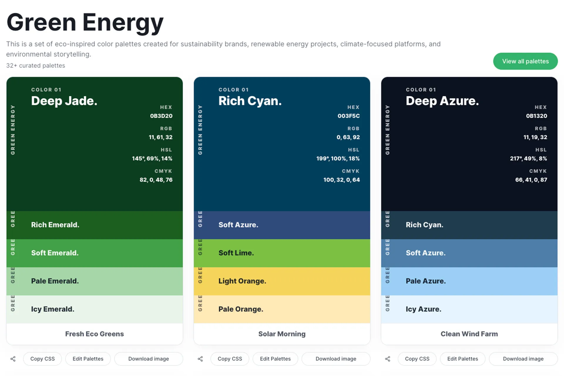
• Green energy tends to use greens, earth tones, and fresh neutrals because it signals nature, sustainability, and balance.
• E-commerce commonly uses high-contrast accents (like orange) for “Buy Now” buttons because energetic accents pull attention and improve action.
This doesn’t mean you must follow one rule forever. But it does mean: if you fight industry expectations too much, you have to work harder to earn trust.
That is the big advantage of industry palettes. They give you combinations that already match what customers expect to see. You can still be unique, but you start from a direction that is proven to feel “right.”
What makes a “Good Color Palette” in real-world design
Many people judge a palette by “nice colors.” But in real projects, a palette must do more than look nice.
A strong palette should solve these practical problems:
Readability and contrast:
Your text must be readable on backgrounds, especially on mobile screens in sunlight. Good palettes consider contrast between text and background so headings, body text, and buttons remain clear. Accessibility guidelines like WCAG talk about minimum contrast ratios (for example, 4.5:1 for normal text in many cases). Even if you’re not building for strict compliance, these guidelines are a great quality benchmark.
Hierarchy:
A palette should naturally guide the eye. Primary color for key brand areas, neutral colors for backgrounds, and accents for action items. If everything is equally bright, nothing stands out.
Flexibility across uses:
A palette should work for a website hero section, a brochure cover, a social post, and a UI card. That means you need both strong and soft colors, not five loud colors fighting each other.
Digital and Print compatibility:
Digital designs often use RGB, while print uses CMYK. If you ignore this, your printed brochure can look different from what you saw on screen. That’s why having multiple formats (HEX/RGB/HSL/CMYK) is useful: it makes your palette practical for both web and print workflows.
How the GEC Designs preset Color Palettes tool helps (and what you can do with it)?
The goal of our tool is simple: give you ready-made palettes that you can use immediately, without needing advanced color theory knowledge.
In the Color Palettes page, palettes are organized by industry, and each palette is presented in a clean UI card format. Each color includes codes like HEX, RGB, HSL, and CMYK, so you can use the same palette whether you’re building a website, designing in Canva/Figma, or preparing a print banner.
The tool is designed to be practical, not just inspirational.
🎨 Ready to stop guessing colors?
Pick your industry and choose a palette that looks professional instantly. Copy HEX, RGB, HSL, or CMYK codes and download the palette image in just one click.
👉 Click here to access the Color Palette Library
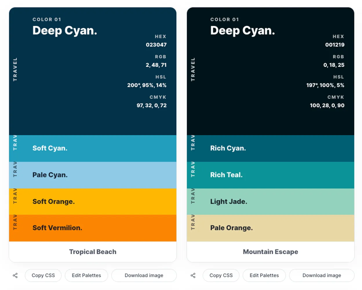
Downloaded Colro Palette Image

Here’s how most users typically use it:
1. Pick your industry (For example, Real Estate or Technology).
2. Browse the palette styles until one matches the “feel” you want (luxury, modern, friendly, bold, calm).
3. Copy the color codes and paste them directly into your project.
4. Download the palette image and share it with your team or keep it in your brand kit folder.
How we created these palettes (the mechanism behind the scenes)?
We didn’t want to create random “pretty palettes.” We wanted palettes that feel natural for each industry and also perform well in real design work.
Here’s the practical approach we follow when building industry palettes:
Step 1: Start with the industry mood and customer expectation
Every industry has a natural emotional direction. Real estate often needs trust + comfort. Healthcare needs calm + clarity. E-commerce needs energy + action. So we begin by defining the emotions the palette should communicate and the typical brand tone used in that space.
Step 2: Choose a strong primary color that “anchors” the palette
The primary color is your identity color. It’s the color people remember. We pick a primary that matches the industry tone (for example, deep blues for trust-focused industries, greens for sustainability themes).
Step 3: Add supporting colors that balance warmth and neutrality
Most designs need neutrals: Backgrounds, Cards, Borders, and Typography spaces. Without neutrals, everything feels heavy. So each palette includes lighter shades (for breathing space) and mid-tones (for UI surfaces).
Step 4: Add one accent color that works for highlights and calls-to-action
The accent is where conversion happens. It’s used for buttons, tags, offers, and highlights. Many palettes include a warm accent (like orange/coral) because warm accents attract attention without requiring the entire design to be loud.
Step 5: Check contrast and usability
A palette must work for text and UI. We validate combinations so you can comfortably place dark text on light backgrounds and light text on dark backgrounds, and still keep the design readable. Accessibility contrast guidance is a strong reference here.
Step 6: Provide codes for multiple workflows
HEX is common for web. RGB is useful for digital design tools. HSL helps when you want to quickly tweak lightness or saturation while keeping the same hue family. CMYK is useful for print planning. That’s why the tool presents these formats together.
This is the real “mechanism” behind the palette library: It’s not just color matching. It’s industry psychology + design hierarchy + usability checks + multi-format output.
🎨 Ready to stop guessing colors?
Pick your industry and choose a palette that looks professional instantly. Copy HEX, RGB, HSL, or CMYK codes and download the palette image in just one click.
👉 Click here to access the Color Palette Library
Sample palettes and how to use them (one example per industry)
Below are examples of how industry palettes typically behave, and where they shine. These are not the only palettes you have (you have 30 per industry), but these examples help you understand the thinking so you can pick the right set quickly.
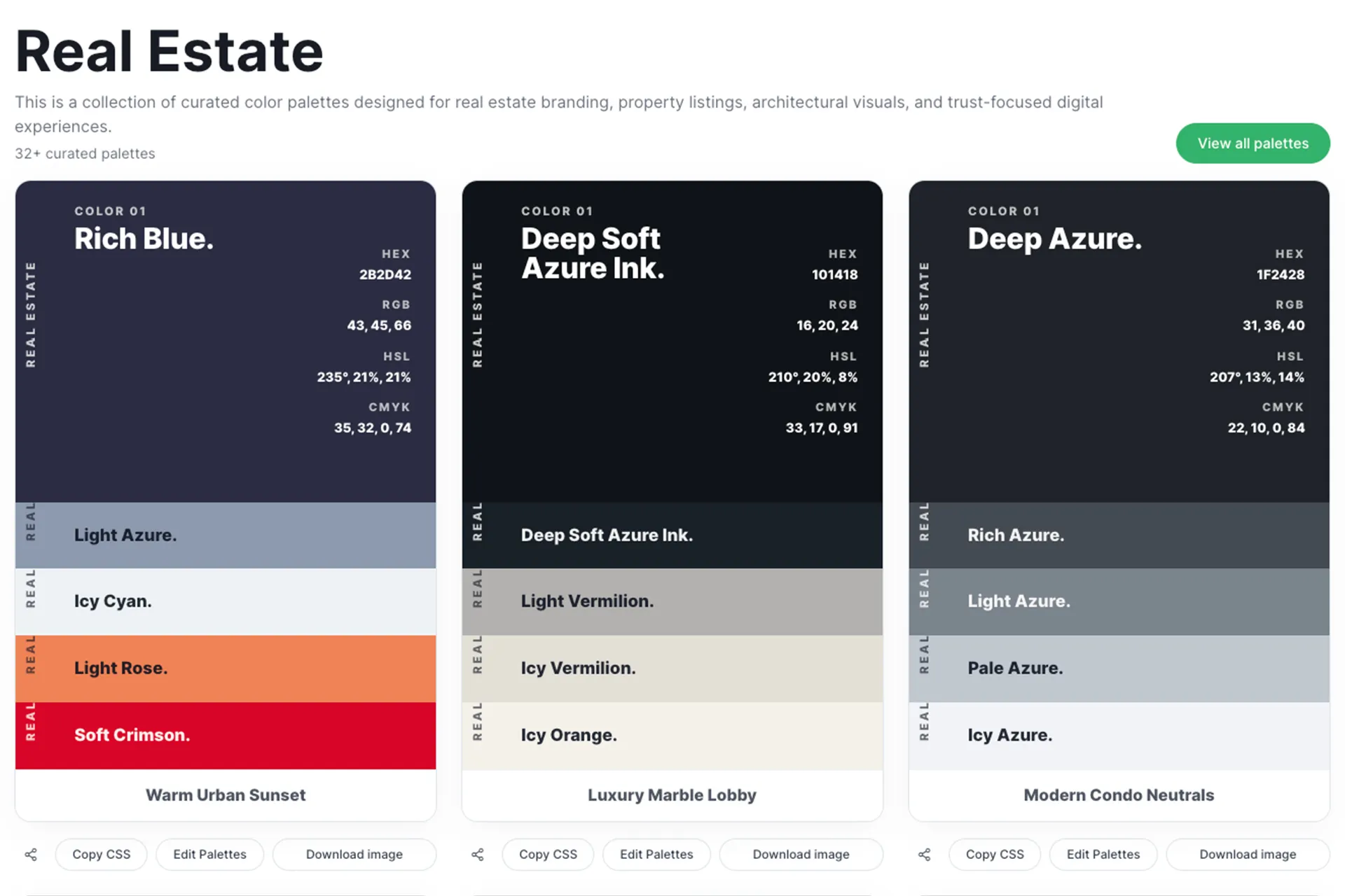
Real estate designs usually succeed when they feel stable and welcoming. People don’t buy homes impulsively. They look for reliability. So real estate palettes often use deep neutrals (charcoal, warm browns, deep navy) paired with soft light shades for backgrounds and calm highlights.
A warm real estate palette is perfect for “cozy home” listings, brochure covers, property feature cards, and neighborhood highlight sections. It also works beautifully for Instagram posts where you want a premium look without shouting.
Use case ideas:
- Property listing flyer where the headings use a deep, confident color while the property details sit on a soft neutral background, creating a balanced layout that feels both premium and easy to read.
- Real estate website landing page with a calm hero section, warm accent buttons, and spacious neutral areas that make the property photos feel more inviting and trustworthy.
- Real estate agent personal brand kit, including logo, visiting cards, social media templates, and email signatures, all built around a stable palette that communicates professionalism and reliability.
- Luxury apartment brochure where dark, elegant tones highlight key features while light backgrounds keep the information clean and easy to scan.
- Social media property showcase posts that use warm accent colors to highlight prices, features, or location tags without overwhelming the design.
Green energy palettes are not only about green. The best ones balance “eco” with “modern.” Too much green can look like a farming brand. So strong palettes mix greens with fresh neutrals, sometimes with blue hints to suggest clean technology and trust.
These palettes are great for solar product websites, sustainability reports, NGO posters, and app UIs where you want a clean, optimistic tone.
Use case ideas:
- Solar panel company website where fresh green headers and soft neutral backgrounds create a modern, eco-friendly feel while keeping the layout clean and readable.
- The sustainability report cover uses calm nature-inspired tones and subtle modern accents to communicate responsibility, innovation, and environmental care.
- Renewable energy startup pitch deck where green and soft blue highlights support the brand story and make the slides feel optimistic and forward-thinking.
- NGO awareness poster that uses a nature-inspired palette to instantly communicate environmental values while keeping the message clear and approachable.
- Mobile app interface for energy tracking that uses clean, optimistic color hierarchy to show usage charts, savings, and notifications without visual clutter.
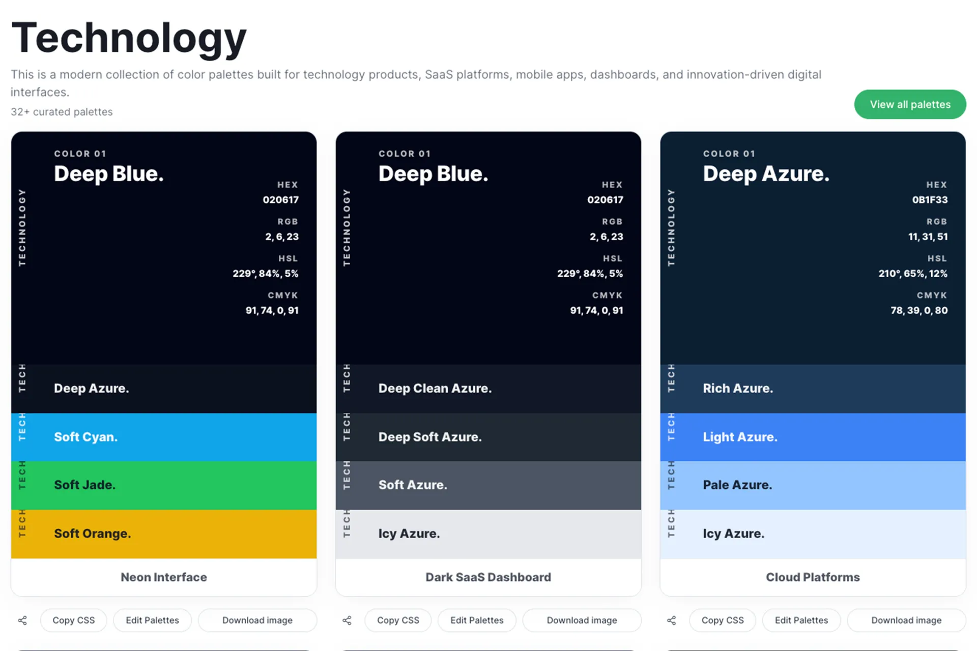
Tech brands need clarity. The palette often starts with deep blues or near-black shades, then adds cool accents (cyan, teal, electric blue) for highlights. This gives that modern SaaS feel: clean layouts, strong contrast, and futuristic calm.
Tech palettes are excellent for dashboards, landing pages, startup pitch decks, and product UI components where spacing and readability are key.
Use case ideas:
- SaaS product landing page with deep blue or near-black backgrounds, bright accent buttons, and spacious sections that give the site a modern, high-tech feel.
- The startup pitch deck is designed with a sleek dark theme and electric accent highlights to create a confident and futuristic presentation.
- Dashboard UI where cool-toned panels and structured color hierarchy help users quickly read charts, tables, and system statuses.
- App onboarding screens using smooth gradients and modern accent colors to guide new users through features in a visually engaging way.
- Tech conference poster with strong contrast, bold typography, and sharp accent colors that stand out in crowded event spaces.
🎨 Ready to stop guessing colors?
Pick your industry and choose a palette that looks professional instantly. Copy HEX, RGB, HSL, or CMYK codes and download the palette image in just one click.
👉 Click here to access the Color Palette Library
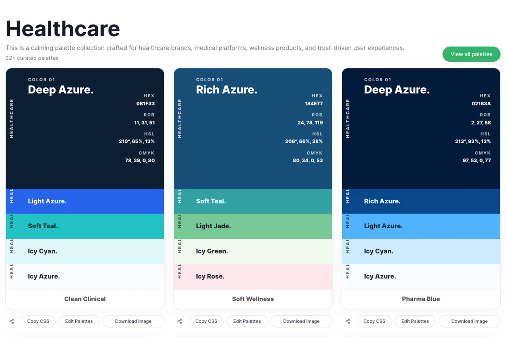
Healthcare is one industry where color mistakes can cost trust instantly. Harsh contrasts and aggressive reds can trigger anxiety. So healthcare palettes commonly use soft blues, gentle greens, and clean whites with minimal accents.
These palettes work well for clinic websites, appointment apps, hospital brochures, pharmacy labels, and even health awareness posters. The overall goal is calm + clarity, not excitement.
Use case ideas:
- Clinic or hospital website where soft blue headers and clean white sections create a calm atmosphere and make medical information easy to understand.
- Appointment booking app with gentle green accents for buttons and highlights, helping users feel guided and reassured during the booking process.
- A hospital brochure where calm tones organize medical services, departments, and contact details in a structured, easy-to-read format.
- Pharmacy packaging that uses soft, trustworthy color combinations to reflect safety, care, and professionalism.
- Health awareness social media posts that use soothing backgrounds and clear accent colors to deliver important messages without visual stress.
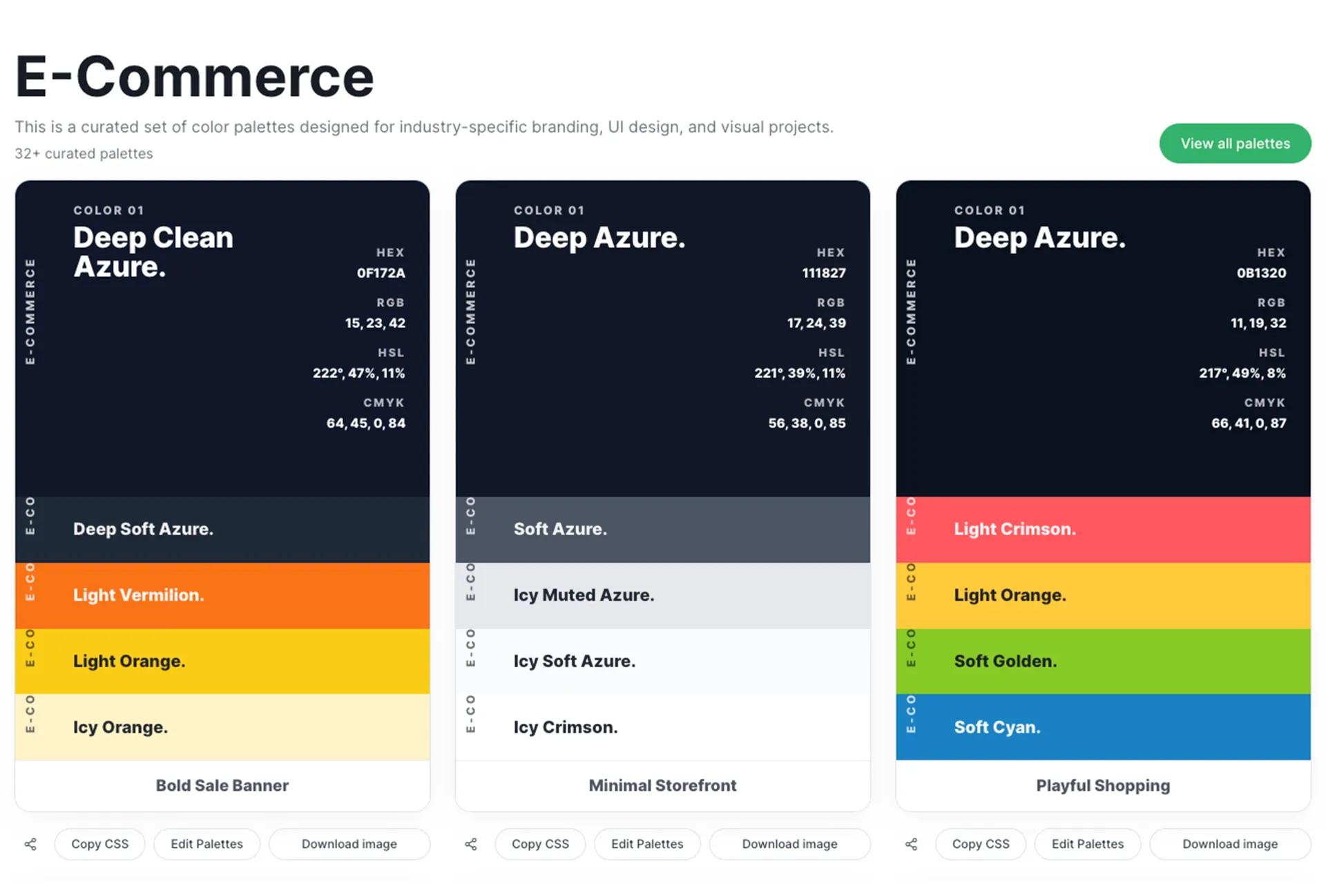
E-commerce is about moving people from browsing to buying. So e-commerce palettes often use simple neutrals for product focus, plus one strong accent color that is clearly reserved for CTA buttons, price tags, discounts, and “Add to Cart.”
These palettes are great for product pages, sale banners, carousel ads, and marketplace UI kits. Warm accents like orange are commonly used because they pull attention fast.
Use case ideas:
- Product landing page where neutral backgrounds keep the focus on product photos, while bright accent buttons clearly guide users toward “Add to Cart” or “Buy Now.”
- Flash sale banner that uses bold accent colors to highlight discounts, limited offers, and urgency-driven messages.
- Marketplace mobile UI where clear color hierarchy helps users quickly identify categories, product cards, and action buttons.
- Email promotion template that uses strong accent colors to highlight deals, coupon codes, and seasonal offers.
- Social media ad creatives with high-contrast product highlights make items stand out instantly in busy feeds.
Finance brands need to communicate safety. That’s why blues and deep neutrals show up again and again. They create a feeling of structure, reliability, and professionalism.
Finance palettes are ideal for investment websites, fintech apps, loan brochures, bank presentations, and even email templates where a clean reading experience is critical.
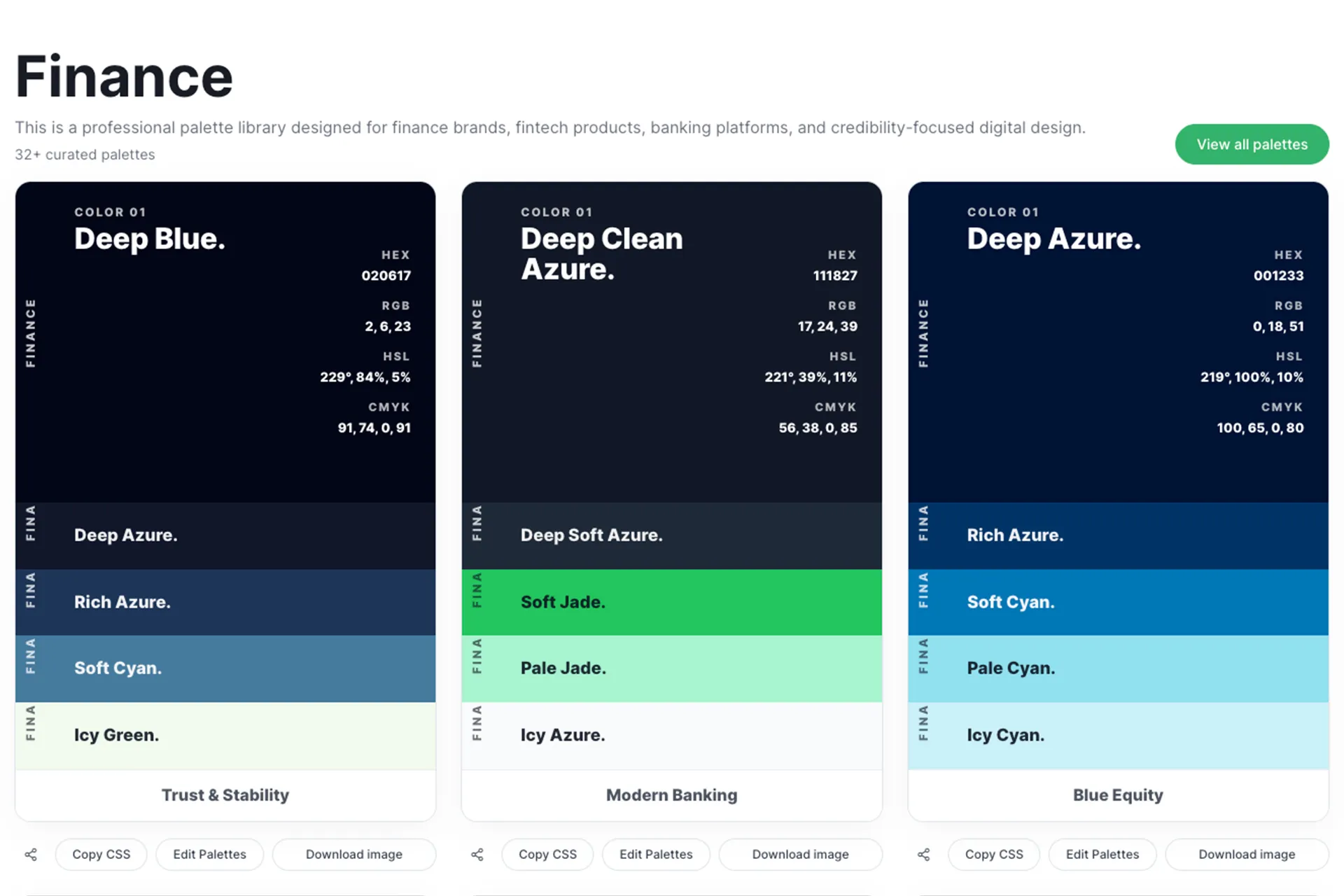
Use case ideas:
- Investment firm website where deep blue headers create a sense of trust, while clean white sections help present financial data, services, and client testimonials in a clear, professional layout.
- Fintech mobile app dashboard that uses structured neutral backgrounds and subtle accent colors to highlight balances, charts, and transaction actions without overwhelming the user.
- Bank brochure design where disciplined color hierarchy guides the reader through account options, loan features, and key benefits in an easy-to-scan format.
- Loan or credit service landing page that uses calm, trust-focused tones to reassure visitors while clearly highlighting interest rates, benefits, and call-to-action buttons.
- Professional email template for financial updates, newsletters, or client statements, using stable brand colors to maintain credibility and consistent brand identity.
Education needs to feel welcoming, not intimidating. Many education palettes blend calm base colors with cheerful accents. The trick is balance: you want energy, but still keep readability for learning material.
These palettes are perfect for school posters, course landing pages, e-learning dashboards, tuition brochures, and classroom presentation templates.
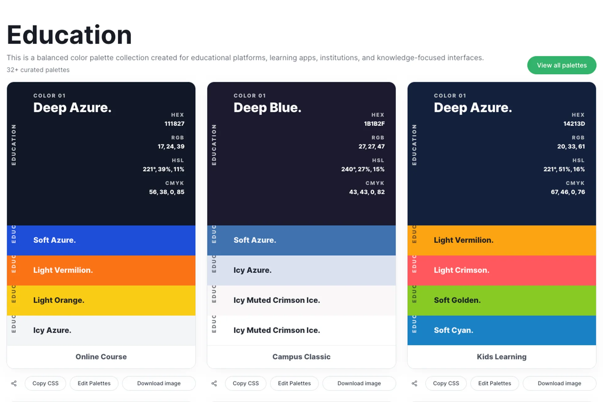
Use case ideas:
- School admission poster that uses cheerful accent colors for headings and icons, while keeping the background soft and readable so parents can quickly understand the information.
- Online course landing page that balances friendly tones with structured sections, helping learners feel welcomed while keeping the layout clean and easy to navigate.
- E-learning dashboard interface where calm base colors reduce eye strain, and energetic accents highlight progress bars, buttons, and important notifications.
- Tuition center brochure designed with warm, student-friendly tones that make the institution feel approachable, supportive, and focused on learning outcomes.
- Classroom presentation slides have soft backgrounds and balanced accent colors that keep students engaged without distracting them from the lesson content.
🎨 Ready to stop guessing colors?
Pick your industry and choose a palette that looks professional instantly. Copy HEX, RGB, HSL, or CMYK codes and download the palette image in just one click.
👉 Click here to access the Color Palette Library
Travel palettes often use sky tones, ocean tones, sun accents, and airy neutrals. They create a sense of openness. If your palette feels too dark, travel designs can feel “heavy,” which is the opposite of what travel marketing needs.
These palettes are great for tour posters, itinerary PDFs, booking sites, resort banners, and travel reels thumbnails.
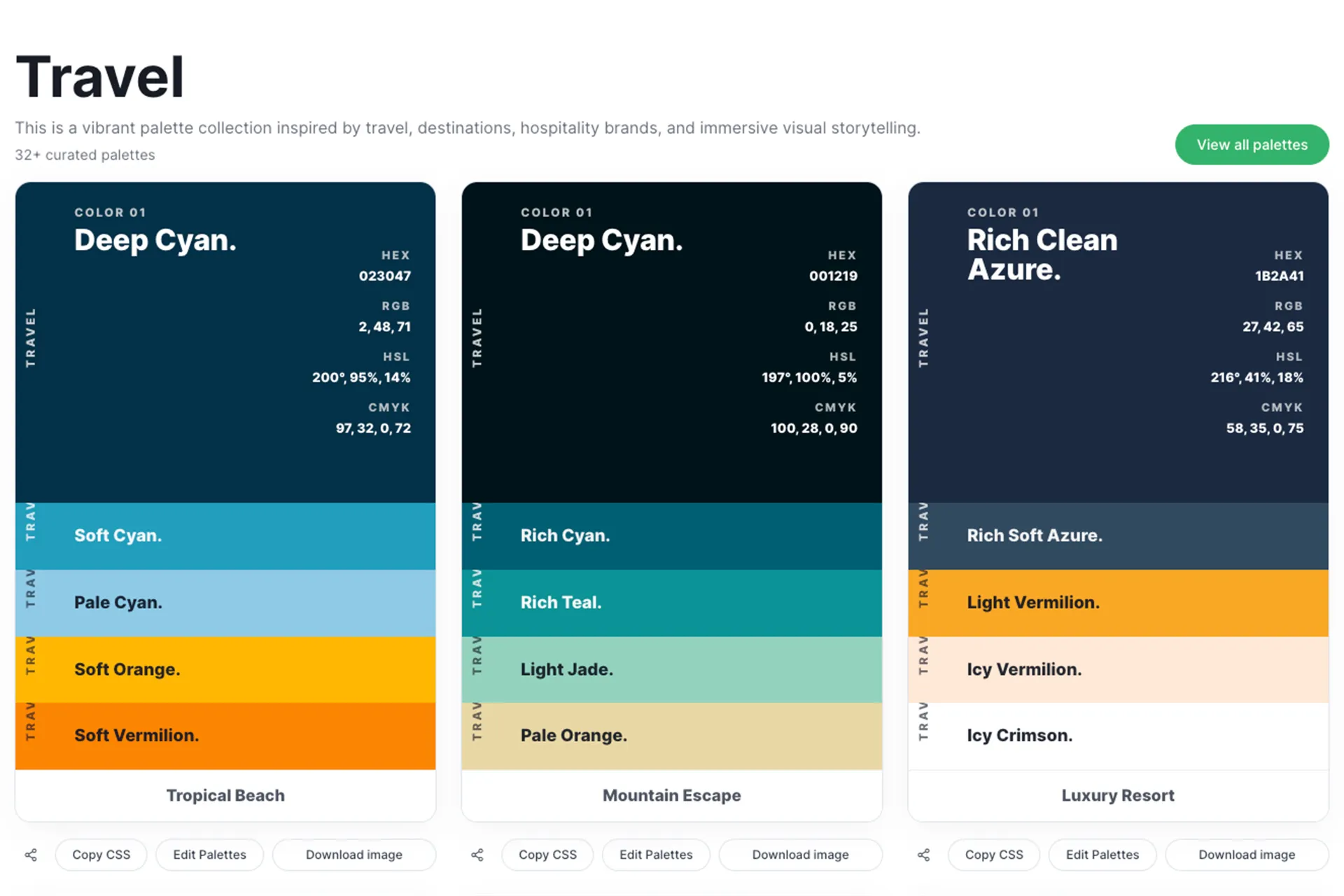
Use case ideas:
- Tour package poster that uses sky blues, ocean tones, and warm sunset accents to create an emotional sense of adventure and destination excitement.
- Travel booking website hero section with airy, open-toned palettes that make the page feel spacious, relaxing, and inviting for first-time visitors.
- Resort promotional brochure where sun-kissed accent colors highlight amenities, beaches, and luxury experiences while keeping the overall layout calm and elegant.
- Itinerary PDF design with fresh, readable section colors that clearly separate days, activities, and travel notes for easy reference during the trip.
- Instagram travel reel thumbnails that use bright, uplifting tones to instantly capture attention and communicate the mood of the destination.
Food branding is highly emotional. Warm tones can trigger appetite and comfort, while fresh greens and clean neutrals suggest healthy and organic. The palette choice depends on whether you’re positioning as a luxury dining, street food, bakery, or healthy meal plan.
Food palettes work beautifully for menus, restaurant websites, Swiggy/Zomato-style promo creatives, packaging mockups, and recipe blog UI.
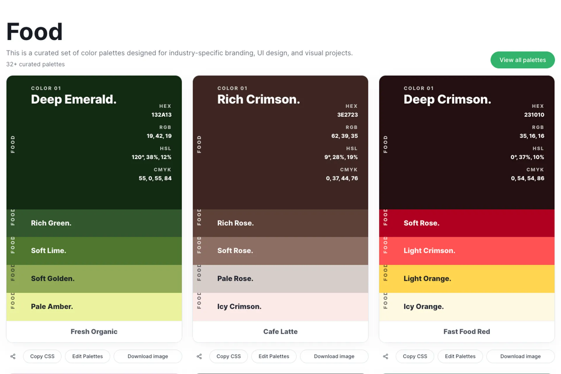
Use case ideas:
- Restaurant menu design where warm accent colors highlight signature dishes, combos, or chef’s specials, helping customers quickly spot popular items.
- Food delivery app banners that use appetizing color contrasts to make dishes look more appealing and encourage faster ordering decisions.
- Bakery packaging with soft, warm tones that create a comforting, homemade feeling and make the product look more inviting on shelves.
- Street food poster using bold, energetic color combinations to reflect the lively atmosphere and attract attention in crowded areas.
- Recipe blog layout that uses fresh, clean background tones so food photos stand out while the text remains easy to read.
Beauty palettes often lean toward soft neutrals, rose tones, broad, elegant accents, and clean, minimal backgrounds. The goal is luxury + softness, not loudness.
These palettes are ideal for skincare product labels, salon branding, Instagram quote posts, landing pages, and beauty e-commerce product cards.
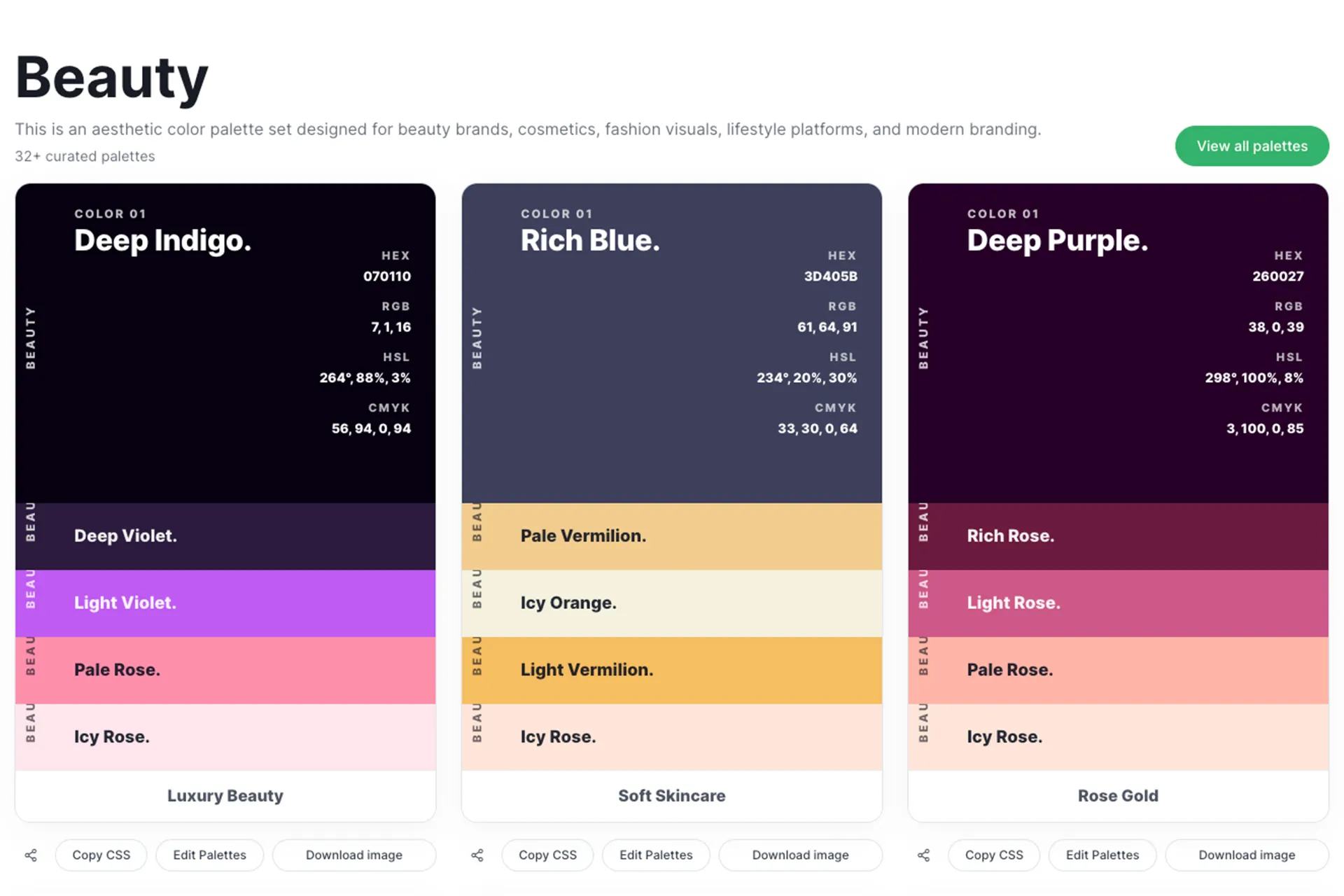
Use case ideas:
- Skincare product label that uses a soft neutral base with a refined accent color to communicate purity, luxury, and gentle care.
- Salon branding kit, including logo, visiting cards, and appointment cards, designed with elegant tones that reflect a premium service experience.
- Beauty Instagram posts that use minimal backgrounds and soft highlights to keep the focus on the product or model while maintaining a polished aesthetic.
- Cosmetics landing page where a premium, balanced color hierarchy guides users through product benefits, ingredients, and purchase options.
- Spa or wellness brochure designed with calming, elegant palettes that instantly communicate relaxation, comfort, and high-end service quality.
Practical ways to use these palettes (Even if you are a beginner)
If you are not a designer, here is the simplest way to apply a palette without overthinking:
1. Backgrounds: Use the lightest color
This keeps your design clean and readable.
2. Text: Use the darkest color
This increases clarity and makes your design look more premium.
3. Primary Buttons and highlights: Use the accent color
Do not use the accent everywhere. Save it for actions and important highlights.
4. Cards, borders, and sections: Use the mid-tone neutral
This creates structure without making the layout busy.
And if you are working for print (Flyers, Brochures, Visiting cards), the CMYK values help you match printing expectations and avoid color surprises.
Final takeaway: The real benefit of using the preset palettes tool
The biggest advantage of using preset industry color palettes is not just about choosing attractive colors. It is about making confident design decisions without wasting time. Instead of experimenting with random combinations, you start with palettes that already match your industry’s tone, customer expectations, and visual standards.
With a ready-made palette, your designs become more consistent, easier to read, and more professional across websites, social media, and print materials. You spend less time guessing and more time building strong, effective designs that look polished from the very first draft.
When you use industry-based palettes:
• Your brand looks more professional and trustworthy instantly
• Your UI becomes clearer, more readable, and easier to navigate
• Your marketing materials stay consistent across all platforms
• You save time on every project by avoiding random color choices