
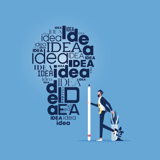


The ultimate flyer design guide | 10 tips to make your design professional

From small businesses to big companies, flyers are one of the most cost-effective and efficient promotion techniques to market your business. We have been using flyers to advertise new products and services, promote sales, and invite people to upcoming events. Even in this digital era, flyers remain a fantastic way to reach your target market and spread the word about your business.
Printed flyers can be displayed in storefronts, attached to bulletin boards, sent by mail, and even distributed by hand in some cases.
In this article, we will share some flyer design techniques to help you create a professional design.
Flyer design best practices
- Choose the right flyer layout
- Consider impact of folds
- Create compelling headline
- Use visual hierarchy
- Create balance
- Make the message clear and focus on benefits
- Keep the content simple
- Choose fonts and colors wisely
- Include call – to – action
- Use high-quality visuals
Choose the right flyer layout
Many free and paid flyer templates are available online that you can customize according to your needs and preferences. You can also use software like Photoshop, Illustrator, or Canva to create your own design. Crafting a professional-looking flyer with limited print space is one of the biggest challenges faced by every graphic designer.

Before diving into the design process, you need to identify the suitable size for your flyer. When choosing the flyer size, consider its purpose, content, and distribution method.
Let’s understand the different flyer sizes,
- A3 size – 11.7 x 16.5 inches – these types of flyers mostly used for large-sized advertisements, music and movie promotions.
- A4 size – 8.5 x 11 inches – it is a standard size. A4 size flyers are used for launching new products, promoting an event, and special offers
- A5 size – 5.8 x 8.3 inches – these types are used for promoting local sales, showcasing discounts, advertising special events like fashion events.
- A6 size – 4.13 x 5.8 inches – these are used for mini ads and offers & discounts
- A7 size – 2.9 x 4.13 inches – A7 sizes are mostly used for pocket ads
- Square size – 4.13 x 4.13 inches – these types of flyers are used for social media campaigns and special promotions.
Selecting the right design layout is one of the most crucial steps because it determines how effectively you communicate your message. The flyer layout is crucial in design because it plays a decisive role in whether your audience will read it or toss it away.
Here are four types of flyer layouts
- Single column flyer layout
- Two column flyer layout
- Multi column flyer layout
- Hybrid layout
Among the four layouts mentioned above, select the flyer layout that best suits your content. If you have more images, opt for a single-column layout. Conversely, if you have a lot of text, the two-column layout is a good choice for you.
Consider impact of folds
Folds can have a significant impact on your flyer design. When using folds, consider the overall purpose, content (including images and text), and the target audience.

Here are the different types of folds commonly used in creating brochures:
- Half-fold – it is a single fold flyer. It divides the single sheet of paper into two and this gives four pages for content. This type fold is perfectly suits for simple product presentation.
- Roll fold – it is a tri-fold flyer, folded twice and it gives six pages for content. The right panel folds underneath the left panel. It gives a perfect balance between design and content and this type of fold is good for general purposes.
- Z-fold – Z fold flyers are also divides the single sheet of paper into three. It gives z shape that folds each panel on top of one another.
- Accordion fold – it divides your flyer into four. It folds each panel on top of one another like an accordion. If you have step by step tutorial or have a variety of products or services to display, accordion fold is best suits for you.
- Gate fold – it also divides the single sheet into three but at unequal panels. As the name implies, the side panels fold like a gate. This type of fold best suits for graphic-heavy designs.
- Double parallel fold – it creates eight panels for content and text. To create this fold, the paper is first folded in half to form two panels. After that, the folded page is folded once again to create two parallel bi-fold brochures. This fold is works well with reference material.
Learn the 10 important tips for designing professional-looking flyers, brochures, or leaflets for your business, covered from choosing a layout to adding quality visuals.
Create compelling headline
A design featuring a killer headline is the best way to grab your audience's attention. Your headline is the first thing your audience will notice when they glance at your flyer. Ensure that your headline accurately represents the entire content of your flyer.
Your headline should be descriptive and concise. Infuse it with powerful words and phrases. To make your headline stand out, consider using action words, asking questions, or highlighting your unique selling proposition.
Related post: 11 tips to write attractive headlines
Incorporate colors into your headline. Colors have a psychological impact on us, and they can help evoke emotional reactions among your audience.
Use visual hierarchy
You can't simply place all the design elements on a page; it should convey to your audience what's important and what they need to focus on. Before delving into how to utilize visual hierarchy in your design, you must understand what visual hierarchy truly means.
Visual hierarchy is a design principle that organizes elements based on their level of importance. It determines where your audience's eyes should look first, second, third, and so forth. Without visual hierarchy, your audience can become overwhelmed, potentially causing them to overlook crucial information. That's why visual hierarchy is highly important in creating a professional flyer design.
6 principles of visual hierarchy
1. Scale – Scale is essential in visual hierarchy as it defines the relative size of each element in a design. Utilize scale to draw attention to specific elements. If you want to emphasize a particular element, simply make it larger than the other elements in the composition.
2. Reading pattern – There are two different scanning styles - the F pattern and the Z pattern. Depending on your designs, these patterns help you decide where to place your most important elements.
F pattern: It follows the shape of the letter 'F,' starting at the top left and moving horizontally across to the top right. Viewers then scan down the left-hand side of the page. Align your important information, such as short headlines, subheads, bullet points, and other attention-grabbers, on the left side of your design. Use this F-pattern for text-heavy designs.
Z pattern: It follows a 'Z' shape. Viewers start at the top left of the page and move horizontally across to the top right, then down on a backward diagonal slope to the bottom left corner, and finally across to the bottom right corner. Use this Z-pattern for less dense designs.
3. Color and contrast – Actually, humans are naturally drawn to colors, especially bright and vibrant ones - wouldn't you agree? In design, color plays a crucial role in directing attention to specific elements. Contrasting colors work exceptionally well for highlighting differences between elements or emphasizing one over the other.
To create contrast, consider combining warm and cool colors with neutral tones to capture a lot of visual attention. Utilize high contrast where you want the viewer's attention to be drawn first.
4. Typography – Typography hierarchy is another crucial aspect of visual hierarchy that you cannot overlook.
Level one: Determine which message deserves the maximum attention. This message should be displayed in the largest font size. This is typically used for the headline or event title you're promoting, the name of the business you're advertising, and similar primary elements.
Level two: Secondary typography is reserved for messages of medium importance. Use level two fonts for details like the event venue, the opening act at your performance, or your call to action.
Level three: Tertiary typography is generally used for the complete message, purpose, or other design details. Body text should be smaller but still highly readable.
5. Texture and style – Texture can be used to emphasize the most critical element of the design.
6. Position – Position plays a vital role in establishing visual hierarchy, alignment, and emphasis in your design. It refers to how you place or arrange elements within your design. Position can be effectively used to create focal points by applying composition techniques like the rule of thirds, the golden ratio, or other methods.
For instance, you can designate the upper left corner of your design as the primary focal point and the lower right corner for the secondary element.
Create balance
When you're in the process of designing a flyer, the temptation to include every bit of information on the page can be strong. However, if your goal is to create a successful flyer design, it's crucial to resist that urge. If you try to cram all the elements into your flyer design, your audience may have no idea where to focus their attention, and as a result, your main message or purpose could get lost in the clutter.
To create a professional flyer design, it's important to keep things balanced and well-spaced. Here are some tips to consider:
- Balance Every Element: Maintaining balance and proportion among elements is key when designing a flyer. For example, if there's a sizable graphic that takes up a significant portion of the design space, it's important to balance it with smaller text to prevent the design from feeling too crowded.
- Use White Space: You've probably heard the famous quote, 'Whitespace is like air: it is necessary for the design to breathe.' White space provides clarity to your designs and allows certain elements to stand out. Don't be afraid to incorporate white spaces in your design. Including ample white space around images and between text blocks helps reduce distractions and draws your audience's attention at a glance.
Make the message clear and focus on benefits
You only have a few seconds to capture your viewer's attention, and it's not just about grabbing their attention; you also need to keep them engaged with your design for a while. This way, you can effectively convey your entire message. Therefore, creating a focal point of attraction is essential.

How to identify focal point?
Ask yourself the following questions to help identify your focal point:
- What message are you trying to convey to the viewer?
- What are your goals with this flyer? Are you looking to attract more customers, promote a special event or sale, announce a new product or service, or simply entertain?
As mentioned earlier, there's no need to overload the flyer with all the available information. Choose one key message and focus on it. Once you've determined your objective, design your flyer accordingly.
The best practice for establishing a strong focal point is to keep your design simple and uncluttered. Utilize images, graphics, font styles, sizes, contrasts, positions, and other visual techniques to highlight the most important points on the flyer.
Keep the content simple
Consider the following to create effective content:
- Keep the information clear, simple, and straight to the point.
- Include only the essential details and ensure the content is easy to read.
- Use easy-to-read bullet points instead of lengthy paragraphs.
- Prefer action verbs over passive voice. For instance, 'We're Hiring' grabs more attention than 'Vacancies Open.'
- Incorporate powerful words and phrases into your content, such as 'Proven,' 'Discover,' 'Unlock,' 'Free,' 'Discount,' 'Save,' 'Guarantee,' and more.
- Clearly communicate what your audience will gain.
- Make contact details and other essential information easily accessible.
- Create an enticing offer and instill a sense of urgency.
Choose fonts and colors wisely
Typography and colors are critical for creating functional flyers. Fonts give your design a distinct look and mood, while colors engage human feelings and emotions.
Using different font styles, sizes, and spacing can help create a focal point and catch the viewer's attention. When selecting font styles, avoid using more than two typefaces in your design. Using more than two typefaces can disrupt the flow of text and divert attention from the main message.
A well-chosen color combination in both images and text accelerates information sharing. Choose a color scheme for your flyer based on your key message. For example, use bright neon colors for party flyers, shades of green or blue to convey health, and black and white for a classy, bold statement.
Understand the color psychology to identify the best color for your flyer design.
Consider the rule of threes when choosing colors for your design. The rule of threes suggests that using three shades has a stronger impact than any other number. Ensure that your color choices align with your professional brand and its objectives. Limit your flyer design to no more than 2-3 colors.
Include call-to-action
Another essential and powerful element of a flyer is the call to action (CTA). Regardless of your flyer's purpose, it should guide your audience on the next steps to take. Whether you want your audience to attend an event, subscribe to your email list, or visit your office for a free consultation, it's crucial to communicate it clearly.
Include vital details about your business, such as your website, contact information, email, location, date, and time, to inform your audience about what they should do next. You can also incorporate a QR code into your flyer that directs your audience to a website or landing page. Ensure that all this information is bold and easily readable.
Use high-quality visuals
Incorporating a visual component that relates to the purpose or theme of your flyer is crucial for ensuring that viewers instantly grasp what the flyer is all about. When selecting an image, consider its quality. Opt for crystal clear and bold images to capture the attention of your target audience.

Ensure that the chosen image conveys a mood, tells a story, and guides your audience towards considering your products or services. Additionally, don't forget to include your logo and slogan on your business or event flyer.
Conclusion
Apply the flyer design tips from this professional flyer design guide to create compelling and effective flyers. If you're new to design, you can also benefit from expert flyer design advice. Alternatively, use pre-built templates and customize them to follow these flyer design best practices, ensuring your flyers are attention-grabbing, captivating, and impactful marketing materials.

Rajanarthagi
Content writer and Marketer
An enthusiastic SEO expert, passion for digital marketing with two years of expertise in writing Digital Marketing and SEO content. She is a Master of Business Administration graduate from a reputed university in south India. Her passion for SEO and online marketing helps her to stay up to date with the trends and strategies. Follow her on social media sites, to stay up to date with SEO, and Digital Marketing, Updates. To contact Raji, visit the contact page.