Use our Color Palette Generator to create, customize, export and share professional color palettes instantly. Perfect for designers, developers and brands.
Let me ask you something.
Have you ever created a design that looked beautiful at first glance, but after a closer look, something felt slightly off? The layout was clean. The typography was solid. The spacing was perfect. And yet, the overall impression lacked harmony. It did not feel unified.
Maybe the button color didn’t quite match the banner. Maybe your social media graphics carried a slightly different tone than your website. Or perhaps your product packaging looked like it belonged to a completely different brand than your online store.
When this happens, most people assume it is a design skill issue. They think they need better tools or more experience. But in reality, it is rarely a talent problem.
It is a color system problem.
Without a structured color palette, every new design becomes a fresh decision. Every banner, every post, every landing page introduces a small variation. Over time, those small variations add up. The brand slowly loses its visual consistency.
And this is exactly why a powerful Color Palette Generator matters more today than ever before.
Especially in the era of AI.
Today, we rely heavily on AI tools to create graphics, ads, mockups, and even full websites. These tools are incredibly powerful. But unless you guide them with clearly defined color codes, they will generate visuals using slightly different tones every time. A lighter blue here. A deeper red there. A background that almost matches your brand color, but not quite.
Those small shifts may seem harmless, but they quietly weaken brand recognition.
A defined color palette acts like a visual anchor. It keeps everything aligned. It ensures that no matter how many designs you create, manually or with AI, your brand still feels like one cohesive identity.
And that consistency is what builds trust, recognition, and long-term impact.
As we discussed earlier, AI has completely transformed how fast we create. Speed is no longer the challenge. Control is.
The real issue is not whether we can produce designs quickly. It is whether those designs stay visually aligned over time.
Without a defined color palette, every new asset becomes a small experiment. One campaign introduces a slightly warmer tone. Another design shifts toward a cooler variation. A new landing page adds an accent color that was never part of the original brand direction.
Individually, these changes look fine.
Collectively, they dilute identity.
I have watched brands slowly drift this way. They start strong. Clear theme. Clear colors. Clear mood. Then, rapid content production begins. Social graphics. Ads. AI-assisted visuals. New creatives every week. Six months later, nothing feels connected anymore. Not because the designs were bad, but because there was no fixed color system guiding them.
And this is the quiet danger of modern design speed.
Color consistency is not a decorative decision. It is a strategic one. It protects brand recognition. It protects emotional familiarity. It protects trust.
A structured color palette acts like a visual anchor. No matter how many assets you create, everything stays rooted in the same identity.
In 2026, where design production is effortless, discipline becomes the differentiator. A powerful Color Palette Generator is not just a creative tool anymore. It is a brand stability tool.
2. The Psychology of Color and Brand Consistency
Color is never just visual.
gecdesigns.com
gecdesigns.com
It is emotional.
Before someone reads your headline, before they understand your offer, they feel your color.
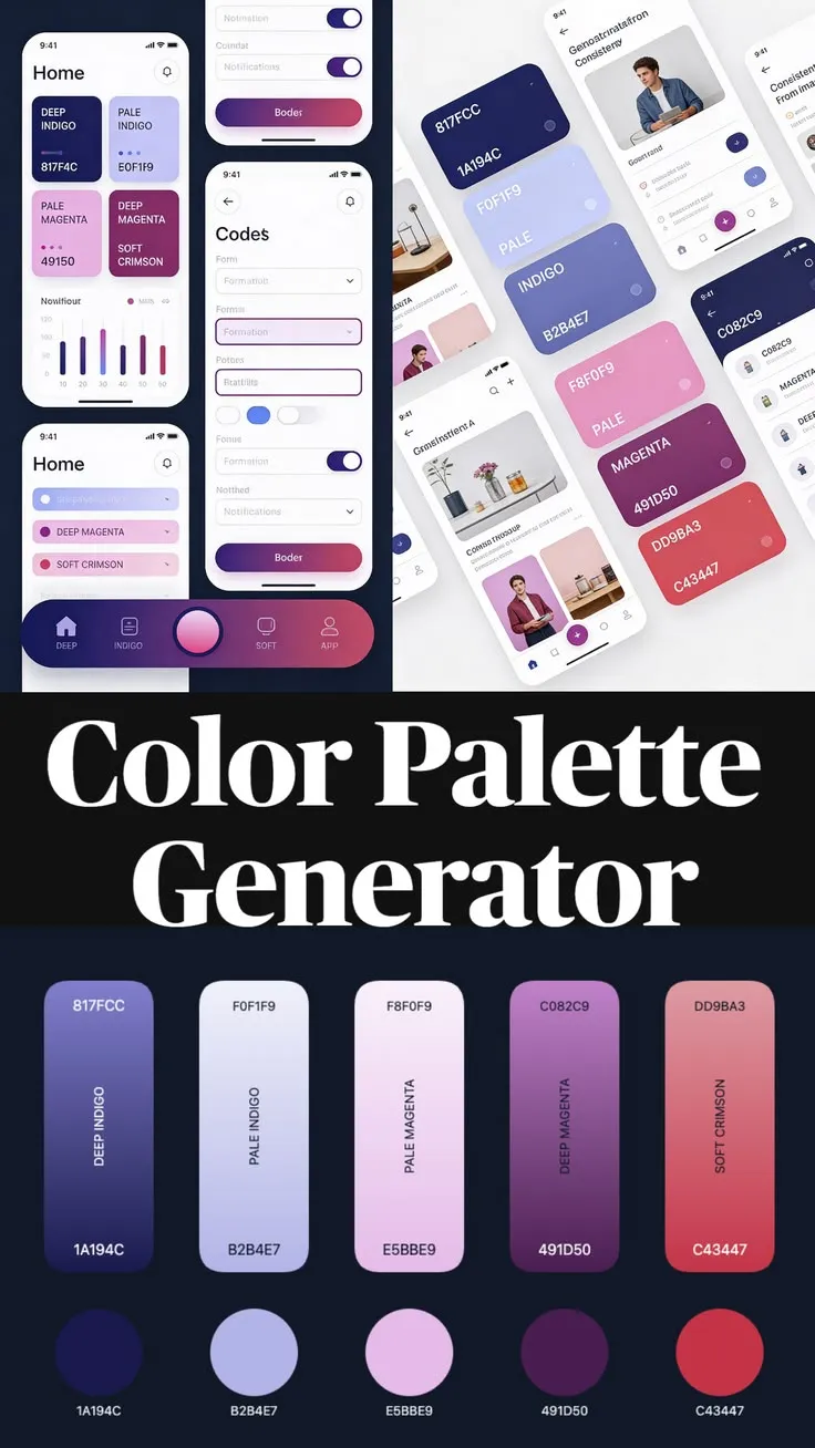
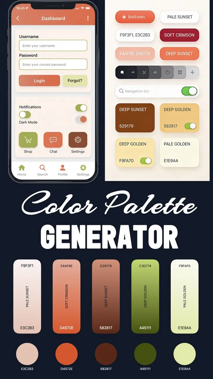
Blue often communicates trust and stability. That is why so many financial and tech brands lean toward it. Red creates urgency and energy. It pushes action. Green suggests growth, balance, or sustainability. Purple frequently signals creativity, imagination, or luxury.
But here is something many businesses misunderstand.
Choosing a color with the “right meaning” is not enough.
Emotion creates impact.
Consistency creates recognition.
Think about major global brands. You can identify them from a single shade. Sometimes you do not even need to see the logo. The color alone is enough. That level of recognition does not happen by accident. It happens because those brands protect their color codes carefully and use them repeatedly across every platform.
A structured palette does more than make things look nice. It creates a visual system that works quietly in the background of every design decision.
A strong color palette:
- Creates visual harmony across all assets
- Builds memory in your audience over time
- Guides attention through a clear hierarchy (primary, secondary, accent)
- Reduces visual confusion
Without a defined palette, every design becomes a fresh experiment. You are guessing again and again. Small differences creep in. Tone shifts. Contrast changes. Mood drifts.
With a palette, decisions become intentional. You are not choosing colors randomly. You are choosing within a system. And systems create strength.
Key Highlights:
- Colors influence perception instantly
- Repetition builds recognition
- Structured palettes create hierarchy and clarity
- Consistency strengthens brand trust over time
When color is treated strategically rather than casually, branding becomes powerful instead of unpredictable.
Now that we’ve talked about why structured color systems matter, let’s move into something practical.
How do you actually build one quickly?
This is where the GECDesigns Color Palette Generator stands out. It is not just a random color machine. It is designed to help you think, explore, refine, and export like a professional, without complexity.
Step 1: Generate or Adjust Your Base Palette
When you first open the tool, everything feels simple. Clean interface. Clear options. No clutter.
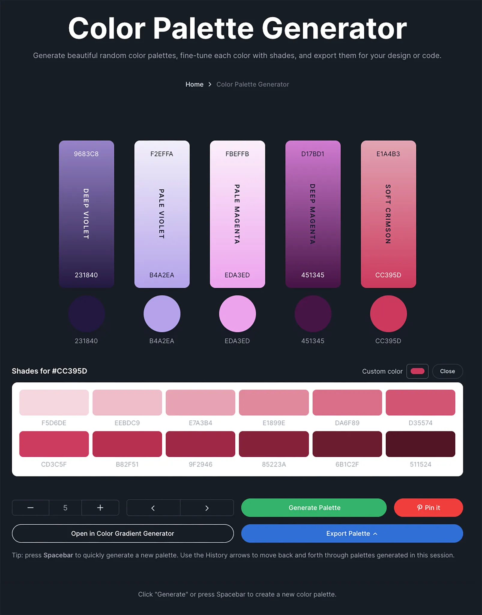
Click the “Generate Palette” button, and instantly you receive a balanced set of colors. Not overwhelming. Not chaotic. Just a structured starting point.
Need more variety for a larger brand system?
Use the plus (+) button to expand your palette. You can go up to eight colors, which is more than enough for primary, secondary, accent, and neutral roles.
Need fewer?
Use the minus (–) button and simplify.
And here is where the workflow becomes enjoyable.
Press the Spacebar.
Every tap generates a fresh palette instantly. It feels smooth. Fast. Almost addictive. You can explore dozens of combinations within minutes.
But what truly makes this powerful is something many other tools ignore: History tracking.
Every palette you generate in that session is stored in local memory. You can move backward and forward through your exploration.
So if you generate twenty palettes and suddenly realize number seven had something special, you can return to it immediately.
- No screenshots.
- No copying codes manually.
- No losing ideas.
That one feature alone can save hours during brainstorming sessions.
Key Highlights:
- Instant palette generation
- Up to 8 customizable color slots
- Spacebar shortcut for rapid exploration
- Back/forward history tracking within a session
Step 2: Fine-Tune Colors with Shades and Precision
Generating a palette is only the beginning. The real strength lies in refinement.
Click on any color pillar, and a shade panel opens. You are presented with 12 carefully calculated light-to-dark variations of that base color.
This is where thoughtful design begins.
Instead of randomly adjusting sliders and hoping for a good result, you can choose structured tonal variations. Maybe your primary color needs a softer version for backgrounds. Maybe you need a darker tone for hover states or call-to-action buttons.
One click updates the palette.
No guesswork. No chaos.
If you want even more control, the custom color bar allows you to navigate freely across the spectrum. You are not locked into preset options. You can select any tone that matches your brand’s exact personality.
And when you click a color circle, the HEX code copies instantly. That small interaction makes a huge difference in workflow speed.
You can paste it directly into:
- CSS stylesheets
- Figma design systems
- Photoshop projects
- Any development or design environment
It is fast. Clean. Efficient.
Key Highlights:
- 12 structured shade variations per color
- One-click palette updates
- Custom color bar for full freedom
- Instant HEX copy for real-world use
Step 3: Export for Code, Design, and Sharing
This is the stage where casual users turn into loyal users.
Click Export Palette, and the tool transforms from a creative playground into a professional utility.
You can copy:
- Full HEX list
- CSS variables with readable names
- Tailwind configuration snippet
- A high-quality downloadable palette image
- A shareable palette URL
For developers, this removes friction completely. The Tailwind configuration can be pasted directly into your tailwind.config. No manual color mapping required.
For designers, the downloadable palette image can be opened in Photoshop or other tools and sampled using the eyedropper. It makes collaboration seamless.
And if you want to go further, you can click Open in Color Gradient Generator. Your existing palette instantly converts into perfectly spaced gradient stops. No manual spacing. No trial and error.
Everything runs inside your browser.
- No uploads.
- No external processing.
- No waiting.
It is private, instant, and workflow-ready.
Key Highlights:
- CSS variables ready for immediate integration
- Tailwind config for modern front-end projects
- Shareable links for team collaboration
- One-click gradient conversion
- Fully browser-based processing
When you step back and look at it as a whole, this is not just a generator. It is a complete color system workflow, from exploration to refinement to production.
And that is what makes it powerful.
There are countless tools online that can generate random colors. You click a button, and a new set appears. Some look good. Some don’t. Most of them stop there.
At first glance, that might feel enough.
But when you are building something serious, a brand, a product, a design system, randomness is not enough.
The difference lies in what happens after the colors are generated.
Most tools treat color generation as a one-time event. You refresh, you lose the previous set. You tweak manually. You copy codes one by one. There is no memory. No system. No continuity.
This is where the GECDesigns Color Palette Generator shifts from being a simple generator to becoming a professional workflow tool.
It offers features that many others overlook:
- Session-based history that remembers your exploration
- Back and forward navigation between generated palettes
- A complete export system for designers and developers
- Tailwind-ready configuration for modern front-end workflows
- Direct integration with the Color Gradient Generator
- Structured shade-level refinement for precision adjustments
That combination changes everything.
Instead of starting from scratch every time, you can explore freely without fear of losing good ideas. Instead of manually recreating colors in your codebase, you export them in production-ready formats. Instead of guessing how a palette would look as a gradient, you convert it instantly.
Most online tools stop at randomness.
This one continues into refinement.
- Into collaboration.
- Into development.
- Into real-world use.
And that difference matters.
Because professional design is not about generating colors.
It is about managing them intelligently.
5. Why Designers Use Color Palettes Instead of Picking on the Go
Let me share something I’ve noticed repeatedly over the years.
Designers who do not work with a defined color palette often move more slowly than they should. Not because they lack creativity. Not because they lack skill. But because every new screen becomes a fresh decision.
They pause longer than necessary.
They test multiple shades.
They second-guess whether a color “feels right.”
That hesitation adds up.
When there is no structured palette, color becomes a constant micro-decision. And micro-decisions drain creative energy.
On the other hand, designers who work with a defined palette move differently. There is clarity. There is confidence. They are not choosing colors from an infinite spectrum. They are choosing from a curated system.
They reuse approved tones.
They assign clear roles to each color.
They build layouts faster because the color logic is already established.
And something else happens.
Revisions decrease.
When a brand has agreed primary, secondary, and accent colors, stakeholders are less likely to question every design. The conversation shifts from “Why this blue?” to “How does this layout perform?”
Consistency Across Every Asset
Think about how many touchpoints a modern brand has today.
- Website.
- Mobile app.
- Social media posts.
- Email newsletters.
- Printed materials.
- Product packaging.
Without a defined palette, each channel risks drifting visually. With a structured color system, everything stays aligned. Even if different teams handle different platforms, the brand still feels unified.
Faster Decisions, Better Focus
When designers are not constantly searching for the “perfect shade,” they can focus on what truly matters: User experience, Clarity, and Conversion.
Less Guessing.
More Designing.
That shift alone can dramatically improve productivity.
Better Collaboration and Communication
Color palettes also improve team communication in ways people underestimate.
Instead of saying, “Can we try that lighter blue?”
You say, “Let’s use #4A90E2.”
Specific. Clear. Reproducible.
Developers understand immediately. Designers stay consistent. Clients see precision instead of ambiguity.
Key Highlights:
- Speeds up creative workflow
- Reduces unnecessary revisions
- Strengthens cross-team communication
- Keeps multi-platform branding aligned
At the end of the day, a color palette is not a restriction. It is a framework. And frameworks are what allow creativity to scale without losing structure.
6. The Importance of Color in the AI Era
This part deserves attention.
AI tools today can generate stunning visuals within seconds. You can create social posts, ad creatives, landing page mockups, and even product packaging concepts almost instantly. The speed is impressive. The quality is often remarkable.
But there is a subtle risk hiding beneath that convenience.
If you do not guide AI with defined color codes, it will make its own decisions. And those decisions are not based on your brand identity. They are based on probability.
One image may lean slightly warmer.
Another may introduce a new accent shade.
A third might adjust contrast in a way that feels “almost right,” but not consistent.
Individually, each asset looks good. Collectively, they begin to drift.
Today, companies rely on AI heavily for:
- Social media content
- Digital advertisements
- Landing pages
- Product mockups and presentations
The more content you generate, the greater the risk of visual deviation, unless you anchor it.
Without a defined palette, your brand does not collapse overnight. It slowly fades into inconsistency. The tone shifts. Recognition weakens. Visual memory becomes blurry.
A structured color palette acts as a stabilizer. It becomes the visual rulebook that guides every prompt, every template, every creative output. Whether a designer builds it manually or AI assists in generating it, the color system remains constant.
In my experience, brands that define their color codes early grow stronger over time. Their audience begins to associate specific shades with specific emotions and experiences. Recognition becomes effortless.
On the other hand, brands that skip this step often find themselves “refreshing” their visuals repeatedly. They think they are evolving. In reality, they are correcting an inconsistency.
In the AI era, creativity is easy.
Consistency is the real strategy.
And consistency begins with a defined Color Palette.
When people hear the term “color palette generator,” they often think it is just a creative tool. Something you use for inspiration. Something fun. But a professional Color Palette Generator does far more than help you pick pretty colors.
It creates structure, and structure changes everything.
When you use a structured palette system, you are not just choosing shades. You are building a visual language that your audience will learn to recognize over time. Every website section, every ad, every product image starts speaking the same visual tone.
Here’s what that really means in practice:
- It builds a consistent visual language across web, mobile, print, and social platforms.
- It saves hours of unnecessary color experimentation and second-guessing.
- It helps maintain accessible contrast when you reuse tested combinations.
- It simplifies developer handoff by providing ready-to-use HEX, CSS, or Tailwind formats.
- It encourages harmonious color combinations instead of accidental clashes.
- It makes your palettes reusable through shareable URLs, so you can revisit and refine them anytime.
Think about how much time is wasted when teams manually experiment with color combinations. Adjusting saturation. Tweaking brightness. Comparing slight variations. Over and over again.
With a defined palette system, those decisions are already made. You are working within a framework that supports you instead of slowing you down.
It also creates confidence. When developers receive structured color variables instead of vague instructions, implementation becomes smoother. When designers use predefined shades, accessibility becomes easier to maintain. When marketers generate new creatives, they stay aligned with the core brand identity.
This is not just about aesthetics.
- It is about efficiency.
- It is about clarity.
- It is about control.
A professional Color Palette Generator gives you the freedom to explore creatively, while still protecting the consistency that makes your brand strong.
Final Thoughts: Build Once, Use Everywhere
Color is not decoration.
- It is identity.
- It is emotion.
- It is recognition.
When someone sees your brand, they do not analyze it logically first. They feel it. And that feeling is shaped instantly by color. Over time, those repeated color experiences build familiarity. Familiarity builds trust. And trust builds loyalty. That is why color should never be treated as an afterthought.
The GECDesigns Color Palette Generator does more than produce random combinations. It helps you build a system, one that supports creativity without sacrificing consistency.
- It gives you control over every shade.
- It gives you consistency across every platform.
- It gives you professional export options ready for real-world workflows.
- It gives you efficiency when moving from idea to execution.
Most importantly, it gives you clarity.
- Instead of guessing.
- Instead of experimenting endlessly.
- Instead of slowly drifting away from your brand identity.
You define your palette once.
Then you reuse it everywhere.
If you want your brand, product, or creative project to feel intentional and cohesive, start with a structured color foundation.
- Press the spacebar.
- Explore new combinations.
- Refine them carefully.
- Export them confidently.
And then build something consistent that lasts, not just for one campaign, but for the long run.