Here are the 8 effective steps to create stunning and powerful logos for better branding. Learn these vital tips from researching logos to finalizing the design.
Are you thinking designing a logo is an easy task? Perhaps, if you think like that, think again.
Because the logo is the very first impression of your brand and it is the identity of your brand. A good, perfect logo has the ability to attract people and convert them into your loyal customer.
So when it comes to logo design, brands need much more attention more than just a design, it needs creativity. I hope this article will give you some valuable insights into the logo designing process.
How to create an effective logo?
Here we have listed 8 simple but powerful tips for an effective logo design.
- Start with a research
- Choose the right design style
- Focus on the qualities of a good logo
- Choose the right font
- Pick colors carefully
- Avoid the clichés
- Generate 20 – 30 sketches
- Shortlist and finalize your design
Start with a Research
It is the most important step in the logo design process. Your logo should describe your brand’s personality so first, you need to understand the personality of your brand. Before developing a logo you need to understand the organization, its mission, values, and the target market. You also need to consider the industry history while creating the logo. You should ask some questions before creating a logo,
- What your brand is all about?
- What is your marketing goal?
- Which is your business target market or who are your target customers?
- What distinguish your business from your competitors?
Choose the right Design style
After you have done your research, now you should choose the right design style. To find out the right logo type you need to test different types of logo formats and choose which type fits and which works best for your brand.
Here are the 6 types of logo formats you need to know,
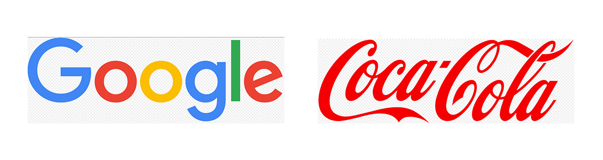
Wordmarks – Wordmark is a font – based logotype. If a company has a short and distinct name these types of the logo are best for them. You need to very careful while choosing the font style, font size, font color to make these types of logos stand out. Example: Google, Fed Ex, Coca-cola.
Monograms ( letter marks ) – These types of logos usually consist of letters, generally brand initials or acronyms. Example: IBM, NASA, CNN.

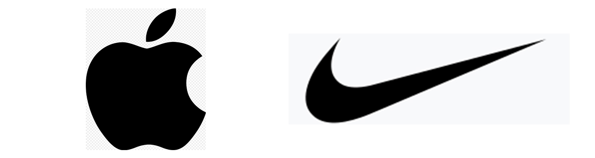
Pictorial marks – Pictorial mark logos consist of an icon or custom image that clearly represents the brand. This logotype is best for well-established brands and it can be a tricky logotype to use for those who haven’t a strong brand recognization. Example: Twitter, Apple, Nike
Emblems – This type of logo consist of a font inside an icon like badges or seals. This logotype gives the traditional feel and this type of logo usually used by schools, universities, and government agencies. Example: Harley Davidson, Warner Bros.

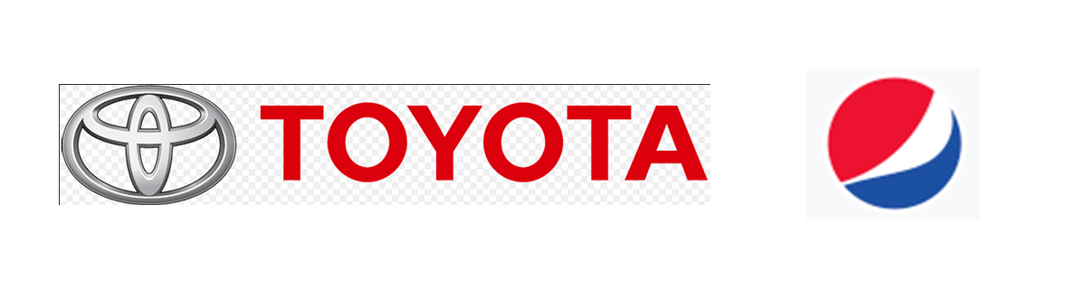
Abstract marks – This logo style consists of abstract shapes. This type of logo tends to send a message to the audience that represents your brand. Example: Toyota, Pepsi
Mascots – Mascots logos are logos that use an illustrated character to represent the brand and these types of logos are easily recognizable as well. Example: KFC, Pillsbury doughboy.

Focus on the qualities of a good logo
What makes a good logo?
All effective logos should have 7 good qualities.
Unique – Make sure that your logo design should never be confused with the others and it should stand out from the other logos in the market. Don’t use stock images, clipart, and logo templates for your logo design and ensure that your design is unique, it should tell the story of your brand.
Targeted - It should be designed for your intended audience. It needs to connect with your audience you are marketing to and make sure that your logo speaks with your target audience.
For example, if you design a children’s toy shop logo, you don’t need to use the image of the toy or the word “toy” in your logo. Instead of you need to focus on the color scheme and font what the children like.
Simple - It should be instantly recognizable and it should be a clean, simple, strong, and engaging design. Aim for simple shapes and simple colors as possible. Keep in mind that all effective logos are simple logos.
Memorable – An effective logo should be easy to remember and it should grab the audience's attention at a first glance. Make sure that your design stays in your audience’s mind.
Versatile – Versatile is the most important quality for a good logo. it should look good at different sizes, any printed materials, any mediums, and applications. It should work well in full color and in black & white as well.
Timeless - An effective logo should be timeless. It should be recognized by generations and it should identity for the company. Make sure that your design withstands decades of changes in the industry.
Relevant - It should visually represent your brand and it should be appropriate for its audience. Your logo should communicate the right tone and style.
Choose the right font
Choosing the right font type and size is the most important part of the process in logo designing. Spend time to research all the various fonts and pick a font depending upon the nature of your business and make sure that the font speaks for your brand.
There are 6 basic types of fonts you need to know for choosing the right font for your logo design.
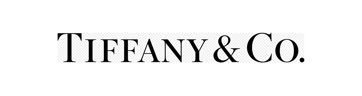
Serif fonts – Serifs are small lines at the end of the larger stroke in a letter. It is a traditional font and due to this traditional nature, these types of fonts carry trust. Serif fonts are perfect for companies who want to build their brand awareness and reliability.
Examples for serif fonts are Times new roman, Georgia, Garamond.
Example for brands that use Serif fonts: The New York Times, Tiffany & Co
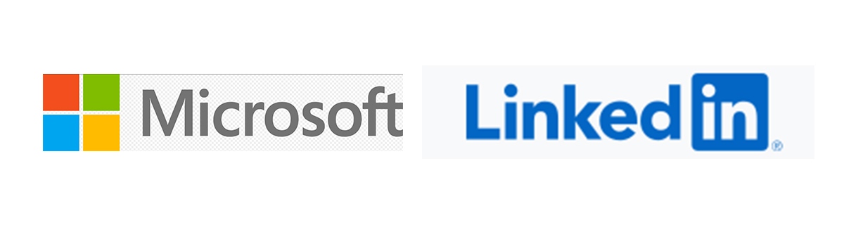
Sans serif fonts – Sans serif fonts don’t have a small line like serif fonts and it has a more modern and clean look. Sans serif fonts indicate a sense of neatness and honesty.
A few best Sans serif fonts are Arial, Helvetica.
Examples for brands that use Sans serif fonts: Microsoft, LinkedIn.
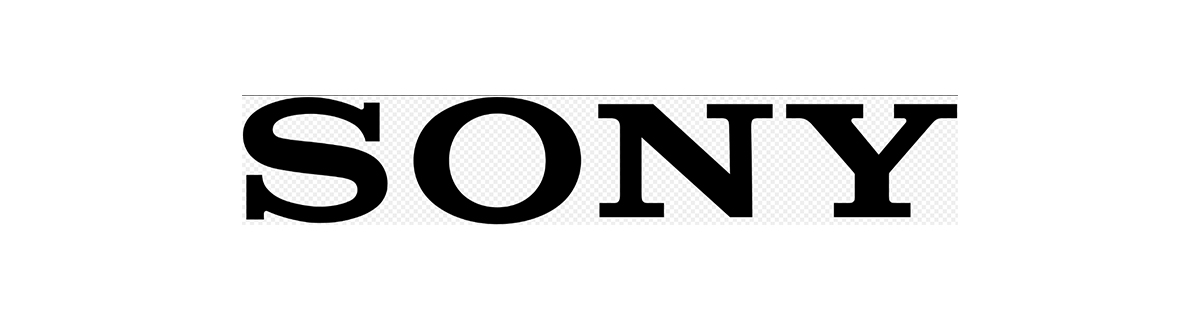
Slab serif fonts – Slab serif fonts look like serif fonts but they have larger feet in them (Looks like slabs). It indicates the sense of bold approach and these types of fonts are perfect for brands who want to convey confidence in their customers.
Examples for Slab serif fonts are Rockwell, Courier.
Examples for brands that use Slab serif fonts: Sony, Volvo.
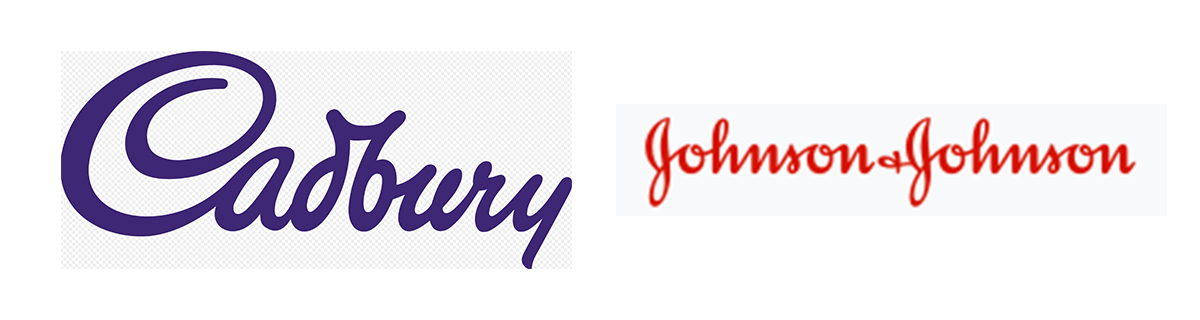
Script fonts – Script fonts look like they were written with a pen. Script fonts communicate ideas of elegance, femininity, and creativity. This font gives more personal touch to your brands and these types of fonts are perfect for brands that want to convey a specific emotion.
If you like to use script type fonts you need to focus on the readability and the readability is the key here.
A few examples for script fonts: Lobster, Alex brush, Lucida script
Example for brands that use script fonts: Coca-cola, Cadbury, Johnson & Johnson
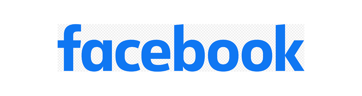
Modern fonts – Modern fonts have thin horizontal serifs and thick/thin transitions in the strokes. These types of fonts communicate the feelings of style, intelligence, and forward-looking ideology and these types of fonts easily attract the audience.
Example for Modern fonts: One day, Aqua, Leo scar
Examples for brands that use modern fonts: Facebook, Shutterfly, Redbull.
Display fonts – Display fonts are unique and these fonts are widely used in logos. Display or decorative fonts convey uniqueness, fun, originality and these fonts can add personality to the brands.
Example for Display fonts: Jokerman, Gigi
Examples for brands that use display fonts: Disney, Lego.

Pick colors carefully
Colors are another most important feature here and some brands are identified by their distinct color only. First, you need to understand color psychology to choose the right color for your logo.
- Red stands for excitement, energy, boldness, passion, and power.
- Yellow represents cheerfulness, optimism, clarity, and youthful energy.
- Orange represents welcoming, cheerful, and confident.
- Pink represents innocence, sweetness, femininity, romance
- Green represents peace, hope, health, balance, and growth.
- Blue represents trust, dependability, professionalism, honesty, strength, and intelligence
- Purple represents royal, creative, imaginative, quality, and individuality
- Black represents classic, elegance, and modernity
- Gray represents neutrality, simplicity, balance, and calm.
Choosing the right color depends upon the emotion that you want to create. Bright and bold colors may attract the audience's attention but it may hard for the eyes. Try different color combinations and try to match your logo color with the overall feel of the brand.
Make sure to use two or minimal colors only and make sure that your logo looks good in black & white and grayscale as well.
Avoid the clichés
Avoid clichés is one of the most challenging parts of the logo designing process. To stand out from the crowd, you need to differentiate yourself with a distinct design. Try different design styles and color combinations until you feel that your design is truly original. Make sure that your design should be entirely your own work.
There are three basic areas you need to focus on to avoid the clichés,
Images and icons – when it comes to logo design, images, and icons are most important here. To avoid clichés, don’t use the most common images or icons associated with your industry.
Many hospitals have red cross or stethoscope in their logos like many aviation companies have images of airplanes or wings in their logos. Try to break the rules of design and try to come up with different and fresh ideas. “Dare to be different”.
Typography – don’t use similar fonts that the other companies used in your industry. Experiment with various font types and choose one from them which makes you feel unique. As I mentioned above, readability is the key here. So keep that in your mind while choosing the font type.
Color choices – try different color combinations but if you want to use the same color which is used by others, try to use it in a different way.
Generate 20 – 30 Sketches
Generate 20 – 30 sketches or ideas for a better design. Use pen & paper to draw your designs and it is actually easier than design it on the computer. Generally, sketching helps to develop your creativity.
Try various design styles, various typography, and various color combinations. Try to translate your creative ideas onto the paper as much as possible. An effective designer will spend more time on sketching and an effective design also comes up from the various sketches.
Shortlist and Finalize your design
After generating more sketches, you need to research and finalize your design. You can shortlist your designs by asking yourself some questions.
- Is it appropriate?
- Is it work well in black & white and grayscale?
- Is it recognizable?
- Is it represent your brand?
- Is it work well across all media?
Make sure that your logo has all the qualities of a good logo. The color and the font used in your logo must specify your brand personality. Aim for visual balance in shape, color, and font.
Conclusion
An effective logo is very essential for brand awareness. Your logo should visually represent your brand, keep that in your mind while developing your logo design. Creativity is the key here, So, don’t hesitate to take a risk at your creative designing skills. I hope the above tips will help you to create an effective logo.