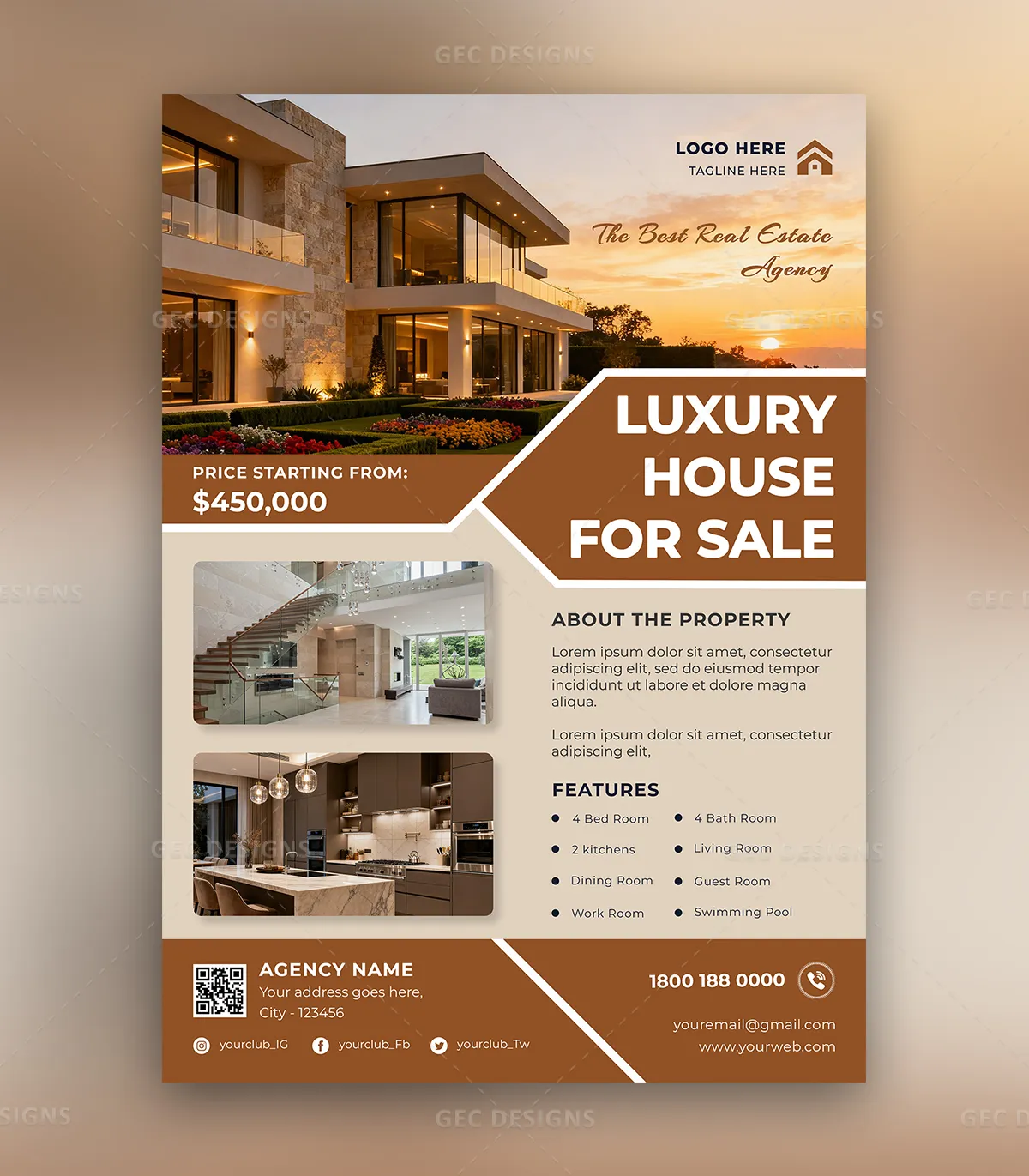
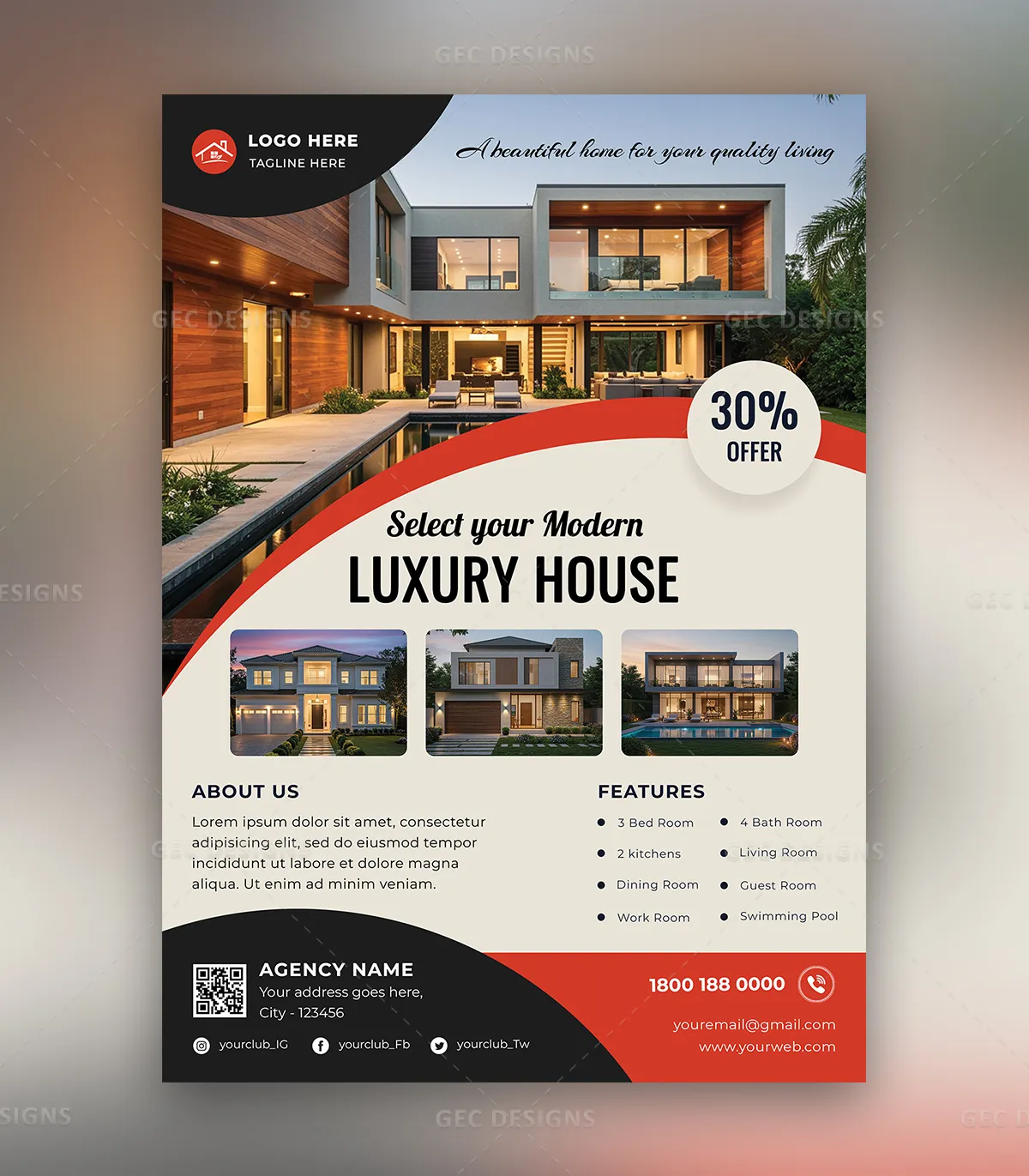
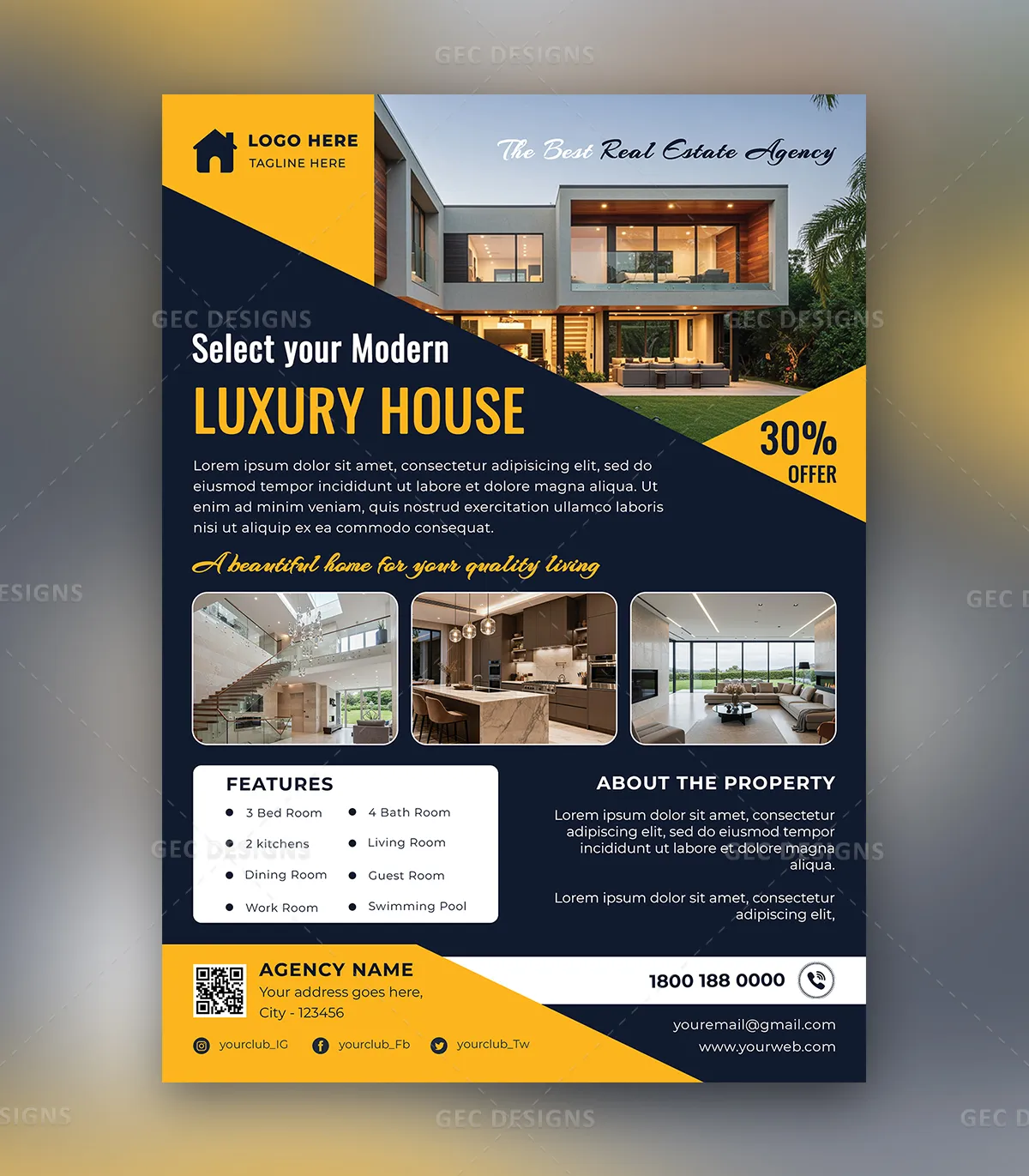
Most real estate flyers fail for the same boring reason: they're built to look "professional" instead of being built to get someone to pick up the phone. A flyer is not a brochure. Nobody reads it cover to cover. It gets about three seconds of attention on a kitchen counter, a community board, or a feed, and in those three seconds it either earns a second look or it doesn't.
After looking at hundreds of agent flyers, the ones that pull responses tend to break a few of the rules that design blogs love to repeat. Here's what actually moves the needle.
Start with the one job the flyer has to do
Before you touch a template, answer one question: what do you want the person holding this to do? Call you about this specific listing? Show up to an open house Saturday? Request a free home valuation? Each of those is a different flyer.
The single most common mistake is trying to do all three at once. A flyer that asks for everything gets nothing. Pick the one action, make it the loudest thing on the page after the photo, and cut anything that doesn't support it.
The seven-second hierarchy
Eyes move in a predictable order on a flyer: big image first, then the largest text, then color, then everything else. Design with that order, not against it.
- Hero photo (top 40–50% of the page). One excellent photo beats four mediocre ones. If it's a listing, lead with the most flattering exterior or the single best room. If it's a personal-brand flyer, a clean headshot works, but the property should still dominate.
- A headline that says something. "Stunning 3BR Home" is wallpaper. "Walk to the lake — 3BR under $400K" gives a reason to keep reading. Lead with the hook: price, location, a standout feature, or a deadline.
- Three to five details, not fifteen. Beds, baths, square footage, price, and one emotional detail ("morning sun in the kitchen"). Resist listing every appliance.
- The call to action, impossible to miss. Your name, phone, and the action — "Call for a private showing" or "Open House Sat 1–3."
- A QR code. This is the highest-leverage thing you can add in 2026. It quietly turns a paper flyer into a digital lead. Link it to the listing page or a booking form, and you can actually measure which flyers worked.
Seven layouts that consistently work
You don't need to invent a layout from scratch. These structures show up again and again in flyers that get responses:
- The single-hero. One enormous photo, headline overlaid at the bottom in a dark band, details in a tidy strip. Clean, fast, hard to mess up.
- The split. Photo on the left half, text column on the right. Reads well when you have a strong vertical image.
- The grid-of-four. One large photo plus three smaller ones. Best for listings where the interior is the selling point.
- The "just listed" banner. A diagonal or corner ribbon doing the heavy lifting up top. Cliché, yes — but it works because people recognize it instantly.
- The open-house card. Date and time are the hero, not the house. Use this when the event is the point.
- The market-update flyer. Less about one property, more about positioning you as the local expert. A simple chart, a short note, your contact details. These build long-term trust.
- The personal-brand flyer. Headshot, tagline, a few recent solds, a testimonial. This is the one you leave behind, not the one you blast out.
The mistakes that quietly kill response
A few patterns show up in nearly every flyer that gets ignored:
- Too many fonts. Two is plenty, one for headlines, one for body. Three is the ceiling.
- Centered everything. Centered text feels formal and slow to read. Left-aligned body copy is easier on the eye.
- Low-resolution photos. A pixelated hero image undoes everything else. Shoot in good light or hire a photographer for listings that matter.
- Cramming. White space is not wasted space. A flyer that breathes looks more expensive than one packed edge to edge.
- No measurable next step. If there's no QR code or trackable link, you'll never know if the flyer did anything.