


Top 10 Most Common Web Design Mistakes to avoid

In today’s digital world, every business needs a website, and it plays a pivotal role in business success. There are thousands of websites are created in a day, and every website owners spend lots of money, time, and effort to ensure their business website is the best in the market because it gives the first impression to customers of that brand.
Your audience will judge your brand by your website design and performance. It is also a symbol of professionalism. Good web design has the ability to build trust, and brand loyalty among your audience.
On the other hand, even a single mistake in your web design will ruin all your efforts. If your website design did not attract or engaging your audience, they will leave your website within a few seconds.
Web design is not just a well-crafted, beautiful layout or design, but it also the usability of the website. In fact, the design of your website directly impacts your user’s experience, and the user experience directly affects the conversions.
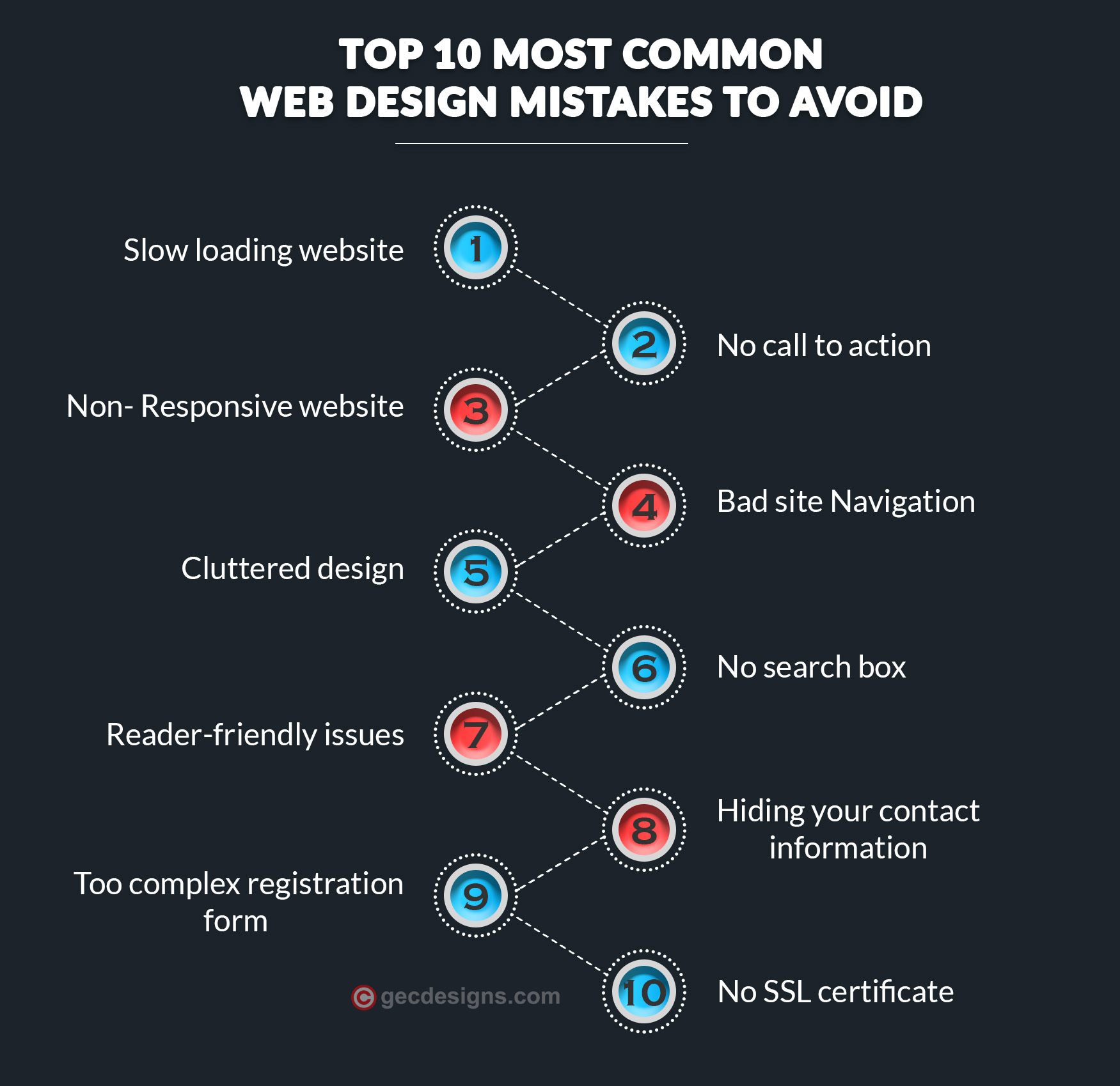
10 Most common web design mistakes to avoid
In this article, I have discussed the top 10 most common web design mistakes and some suggestions to avoid those mistakes easily.
- Slow-loading website
- No call to action
- Non- Responsive website
- Bad site Navigation
- Cluttered design
- No search box
- Reader-friendly issues
- Hiding your contact information
- Too complex registration form
- No SSL certificate
Slow-loading website
Website loading speed is an important aspect of user experience. Usually, people are impatient online, and they abandon your website and look for another one if it takes more than 3 seconds to load.
In fact, According to a recent study, 47% of customers expect a webpage to load within 2 seconds or less.
If your website takes time to load, then your website bounce rate will increase gradually. The loading speed of your website not only affects your traffic and conversion rate but it affects your reputation as well.
Compress all your website images, Serve images in next-gen formats such as WebP, JPEG 2000, and JPEG XR, Use a Content Delivery Network, Remove unnecessary plugins, Minify HTML, CSS, and Javascript, Put CSS at the top and JS at the bottom, Minimize HTTP requests, Use a fast web host. Implementing these simple techniques will greatly help you to improve your website’s loading speed.
In our previous blog post, we have discussed the 13 effective ways to improve your website’s loading speed.
Web design mistakes cost you more than you measure. Are you aware that Your customers judge your brand by the performance, design, and usability of your business website?
No call to action
No call to action is one of the terrific mistakes in web design, because it guides your visitors and it gives clear direction to take a specific action that you want them to do. CTA helps to convert a visitor into your consumer, and it helps to increase your click-through rate as well.
Here are some tips to design an effective call to action
- Keep your call to action short and simple
- Make it easy to find at first glance
- Make sure that the color of the CTA button should be contrasted with your background color, and it must entice your visitors to click
- Choose the words of CTA wisely and keep it to the point
- Make it clear to your visitors, what they will get when they click the button
- Start your CTA with a verb like Add to cart, download here, view packages, and learn more
- Create a sense of urgency in your CTA. Use time-sensitive words like the limited offer, shop now, today only, and only X days left
- Add visual cues in your CTA such as icons or small illustrations
Non-Responsive Website
A non-responsive website is another big mistake in Web designing process. In the modern digital world, the number of customers using their mobile phones to visit websites is increasing day by day. Do you know? The percentage of people using mobile phones will reach 6.9 billion by 2020.
According to Statista, in 2020, 50.8% of all website traffic was generated through mobile phones. So it is necessary to make your website responsive on all devices to stay ahead of the competition.
If your website is not a responsive design, you will not be ranked higher on Google's search engine results page, and also you will have high bounce rates.
In responsive web design, the web page automatically adjusts based on the device it is being seen through. In mobile devices it should be easy to read without zooming, it should be easy to navigate, buttons and links should not be so close to each other, and it should be large enough to tap with a finger.
Don’t block JavaScript, CSS, or image files, Don’t use pop-ups or a full-screen pop-up. These represent poor user experience on mobile devices. Don’t use flash, don’t use too many redirects, and make sure your page is not too slow, these tips will help you to make your website mobile-friendly.
Bad site Navigation
Website navigation is the backbone of every website, and it directly impacts the user’s experience. Unfortunately, many website owners don’t focus on website navigation. They don’t recognize the importance of website navigation.
Effective website navigation acts as a roadmap to your website. It helps your visitors to find things easily on your website. If a visitor finds difficulty in navigating through your website, they don’t like wasting their time to search on your website, and they will leave your website right away.
Bad & Unclear website navigation increases the bounce rate and that affects your traffic. It also affects your search engine rankings and conversions.
Website navigation best practices
- Put your navigation in a standard place – it should be placed at the top of the page or at the left side of the page.
- Keep it simple – too many items on the main menu will distract your users. Don’t have more than 7 menu items and Your menu text should be short, clear, and descriptive.
- Limit drop-down menu levels – too many submenu levels will make your navigation cluttered
- Link the logo to the home page – make it easy for your visitors to return to a home page by clicking on a logo.
- Follow the three-click rule – make sure that every page of your website should be reachable in 3 clicks.
Cluttered design
If your webpage has too many elements such as images, ads, and text on the screen without enough free or white space, and it doesn’t organize in a logical way, it makes your visitors feel that the design is cluttered.
The cluttered design may confuse your visitors, they don’t know what to click, and that makes your visitors walk away from your website.
Here are some tips to eliminate clutter on your website
Create a clear hierarchy
Visual hierarchy on the website is an arrangement of website elements or information based on their importance.
It helps to guide your visitors to scan the information quickly, and easily. It also leads your visitors directly to the most important information on your website. So make sure that the important information present at above the fold. It will help to increase your conversion.
Keep your goals in mind when creating a hierarchy and prioritize the information or elements based on its importance.
Eliminate all unnecessary elements
Too many elements on your web page may distract your visitors. So it is important to check every element of your website to decide the necessity of the elements and eliminate all unnecessary elements.
Use white space
White space is also known as negative space.
"Whitespace is like air: it is necessary for the design to breath." - This is one famous quote by Wojciech Zieliński.
Including enough white space around images, and between text blocks, improve your website’s readability. It will also grab the attention of your visitors. White space gives clarity to your web page, and it helps some elements of your webpage to stand out.
No search box
Having a search box is very important for every website, whether it is a blog or a business website. The search box makes the website easy to use, and it allows your visitors to find immediately what they are looking for.
The search box should be placed at the top left or top right of every page on your website. Use the magnifying glass icon in a search box. Also, Make your search box simple, a single search field with a magnifying glass button.
Highlight the search bar with attractive colors. Use the auto-suggestion mechanism in your search box will help your visitors to find exactly what they are looking for.
Reader-friendly issues
Readability is very important in web design more than anything else. Do you have the experience that you feel hard to read the text on any website? If that is the case, you leave the website immediately. Right?
Don’t let this happen to your visitors. It will affect your reputation.
Even if you have a good layout, informative content and quality images, your visitors just walk away from your website within a few seconds if your website is not reader-friendly.
To improve readability, you need to use the best colors and fonts.
Here we have listed some tips to improve your website readability.
- Choose highly readable, standard fonts. Ensure the font size is at least 16px or more.
- Make sure your font size is large enough to read easily.
- Limit your line length. If your line of text is too long, it is really hard to follow, and too short lines are stress to your reader’s eyes.
- Having 60 characters per line including spaces for good readability. For mobile devices make it 30- 40 characters.
- Don’t use blinking text because it will distract your users.
- Make sure that you pick a typeface works well in different sizes.
- Make sure that the color of the text should be contrasted with the background. Light grey text on a white background will not be readable.
- Don’t overuse extremely bright colors, that will give fatigue to your reader’s eyes.
- Use minimum colors on your website.
- Break up the text blocks into short paragraphs.
Apart from the above tips, you can also use some quality images to improve readability.
Hiding your contact information
Whether you are a business website or a blog, a contact page is necessary for all websites. Do you know? the contact page is one of the most visited pages on any websites.
Converting visitors into consumers is the main goal of every online business. If you hide your contact details or if your visitors feel that it is hard to find the contact information, you will lose your business with your competitor.
Present your contact details in the header or footer section or in a separate contact page. Make sure that your phone number, address, and contact form are easy to find. Add social media buttons, and link in your social media profiles section on your website.
In an online business adding a location on the map helps you to build trust among your visitors.
Too complex registration form
Registration forms are important for an online business to maintain a relationship with your customers.
Keep your registration form simple with distinctive colors, ask only necessary information and eliminate unnecessary fields. Let your users register with their social media accounts. Mark optional fields in registration forms instead of required fields that will help to improve usability and Make your registration form mobile-friendly.
No SSL certificate
Nowadays having SSL certificate is very essential for websites because SSL helps to prevent hacker attacks. SSL encrypts every bit of information transferred between the server and the end-user.
No SSL certificate means that the website is not a secured site and some browsers advise users that the website is not safe. It affects your user experience, and it affects your rankings as well. Google has confirmed that HTTPS as a ranking signal since 2014.
If you collect the personal information of visitors or selling products on your website, it is absolutely necessary that your website is being secured. SSL certificate helps you to get your visitor’s trust.
Conclusion
I hope this guide will help you to avoid mistakes in your web design process. Consider the above tips and suggestions when designing your website. User experience is the highest priority in web designs, so keep your audience in mind while designing your website.
We provide the best website designs and you can contact us for your projects. Our team is here to help you to build your online presence.

Rajanarthagi
Content writer and Marketer
An enthusiastic SEO expert, passion for digital marketing with two years of expertise in writing Digital Marketing and SEO content. She is a Master of Business Administration graduate from a reputed university in south India. Her passion for SEO and online marketing helps her to stay up to date with the trends and strategies. Follow her on social media sites, to stay up to date with SEO, and Digital Marketing, Updates. To contact Raji, visit the contact page.